PHILLIP WINDLY GEEM
BASED IN SAN FRANCISCO
CURRENTLY AT GOOGLE LAB & SMILE FLOWER STUDIO
PREVIOUSLY AT OPEN AI, NIKE, WIEDEN+KENNEDY, NEED, 2x4, WAX STUDIOS, CJ ENM
SELECTED WORKS:
PHILLIPKIM0503@GMAIL.COM
@PHILLIP.WINDLY
CREATIVE SERVICES:
BRANDING, CREATIVE DIRECTION, UI/UX, AI CREATIVE, AND ART DIRECTION

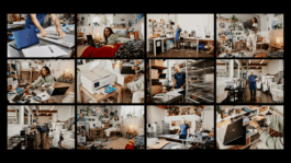
COMING SOON
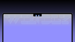
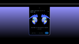
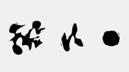
PET WINDLY
UIUX / DEVELOP
Pet WINDLY is a living creature that lives inside your Mac's notch — always watching, always there. Inspired by Tamagotchi and Murakami's iconic eyes, it turns dead hardware space into an emotional companion that reacts to your mood, remembers what you say, and fades your forgotten thoughts back into view through a forgetting curve system. Built entirely through AI-assisted development — from concept to working prototype.

2022
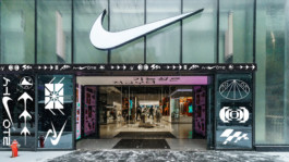
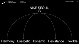
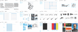
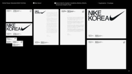
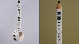
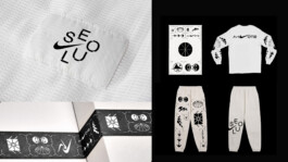
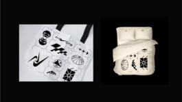
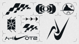
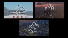
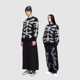
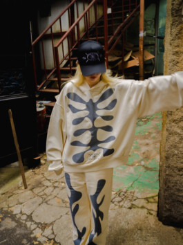
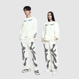
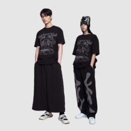
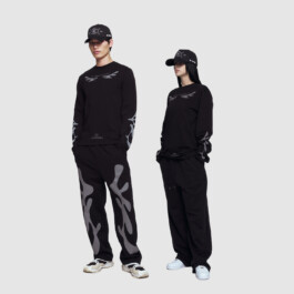
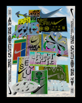
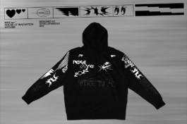
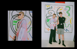
NIKE KOREA
Branding, Art Direction
Nike Seoul rebranding project integrates Nike’s pursuit of victory and collaboration through “manse,” a Korean exclamation symbolizing peace and stability. The paradox of Seoul—where nature and human innovation coexist—emerges as the “curve,” a key motif in Korean aesthetics. This curve represents flexibility, connecting Nike and Seoul through synergy and innovation. We focused on visualizing “curve” and “fusion” across the logo, overarching identity system, and applications. The guidelines remain simple yet adaptable, ensuring a cohesive but flexible brand system.
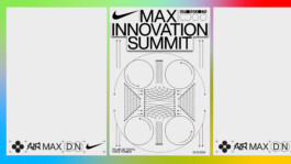
2023
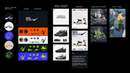
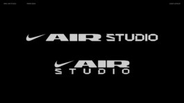
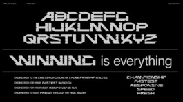
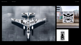
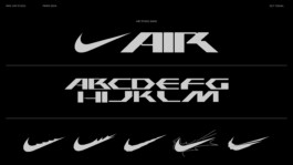
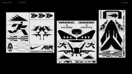
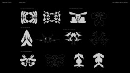
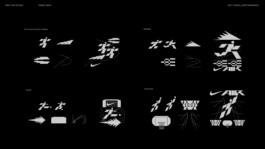
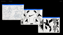
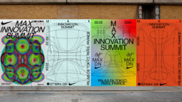
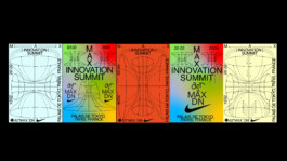
NIKE AIR STUDIO
Branding, Key visual
Nike Air Studio represents the intersection of movement, customization, and innovation, providing a platform for athletes and creators to personalize their gear and engage with performance-driven storytelling. The balance between structured design and creative expression is reflected in high-energy graphics, modular layouts, and dynamic pictograms, symbolizing the continuous evolution of sport and self-expression. The design system for Nike Air Studio reinforces Nike’s vision of speed, adaptability, and artistic sport, ensuring a cohesive yet flexible identity. Unified typography, key visuals, and scalable assets into a branding system that balances boldness with versatility and structure with fluidity.
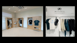
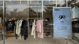
2024-2025
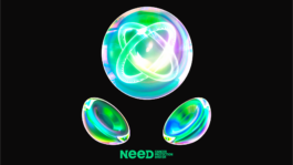
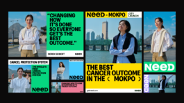
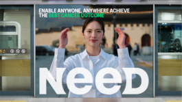
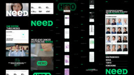
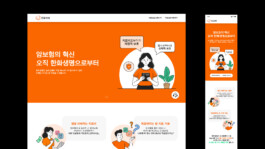
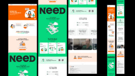
Need inc
Creative Direction, Branding, Art Direction, Digital Design, UI/UX, Marketing, and more
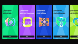
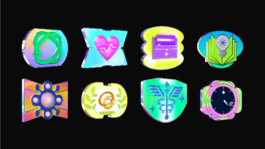
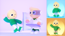
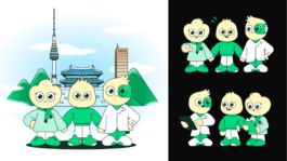
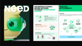
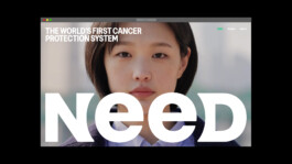
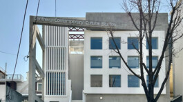
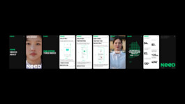
Need is a global brand pioneering the world’s first Cancer Protection System, operating across San Francisco, Seoul, and Tokyo to deliver accessible healthcare innovation through a human-centered design approach.
As Creative Director, I built and led the in-house creative team from 0 to 1, shaping a high-performing culture that drives both innovation and executional excellence. Beyond branding and product design, I collaborate as a thought partner to leadership—defining the brand vision, building its voice and system, and ensuring the mission translates into a clear message and the best experience for people.
I directed product design, brand campaigns, productions, social initiatives, events, and storytelling for partnerships, overseeing every touchpoint and channel. Collaborating closely with the growth team, I refined the brand’s direction and messaging to align user experience with business objectives—strengthening partnerships, scaling market presence, and elevating brand awareness globally.
Need Website
Need Youtube
Need Instagram for Korea

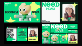
2024-2025
Need inc
Creative Direction, Branding, Art Direction, Digital Design, UI/UX, Marketing, and more
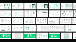
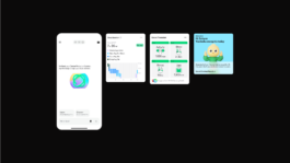
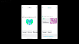
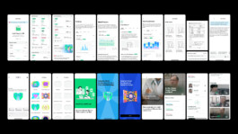
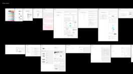
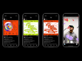
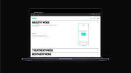
Led design across two core applications: Need App for patients and Hero App for doctors. Working both as a design lead and an IC alongside two designers, I collaborated with developers, researchers, and physicians, and through multiple rounds of user testing to craft the best possible user experience. Beyond functionality, I ensured that every touchpoint reflected Need’s brand values—translating the company’s message into a clear, consistent, and empathetic visual language. To maintain quality and efficiency at scale, I built and operated a comprehensive design system that streamlined execution while enabling the brand to grow with consistency and impact.
2025
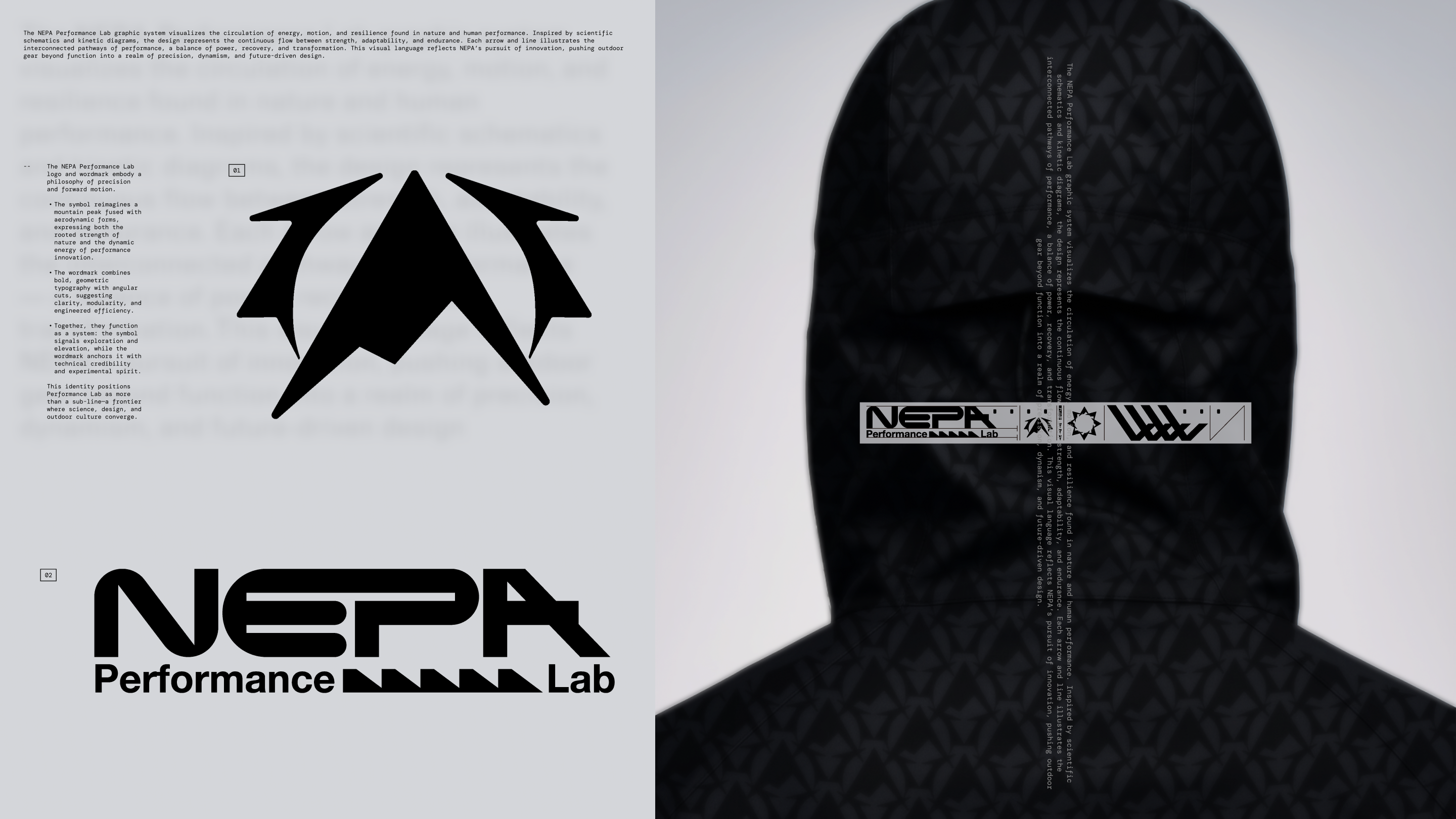
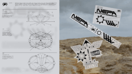
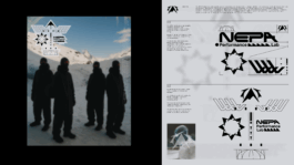
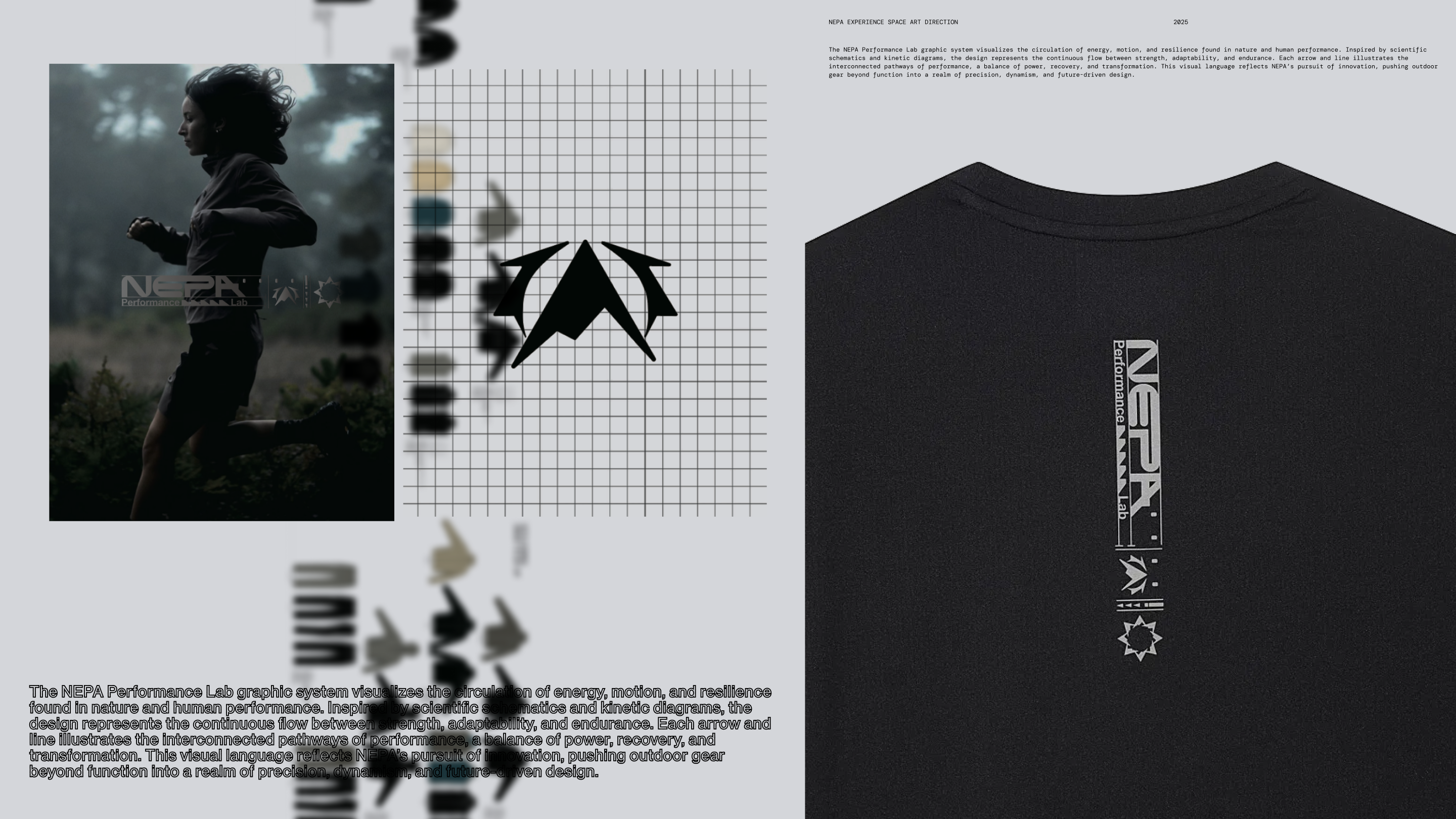
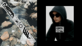
NEPA PERFORMANCE LAB
Identity System, Key Visual
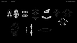
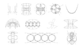
The NEPA Performance Lab identity system explores the intersection of outdoor performance and engineered precision. Inspired by scientific schematics, kinetic diagrams, and modular codes, the design visualizes the circulation of energy, motion, and resilience found in both nature and human performance. Geometric forms, arrows, and directional motifs highlight adaptability, strength, and forward momentum, while architectural elements emphasize structure, experimentation, and transformation.
This visual language positions NEPA Performance Lab as more than an outdoor line—it is a frontier where science, design, and culture converge. By creating a system of scalable key visuals and graphic codes, the identity amplifies the brand’s innovation-driven spirit, expanding outdoor gear beyond function into realms of precision, dynamism, and future-focused design.
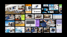
2021
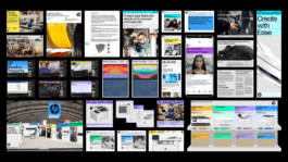
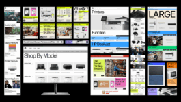
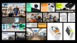
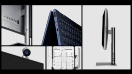
HP
Rebranding by Wieden+Kennedy
The HP branding refresh was led by Wieden+Kennedy, retaining HP’s iconic color identity while infusing it with a sense of technological innovation and modernity. A new visual system was developed—spanning typography, treatments, grids, and color frameworks—designed to be both highly functional and adaptable across applications. This systematic approach provides smart, flexible solutions that ensure consistency while allowing for dynamic use, depending on the context and purpose.
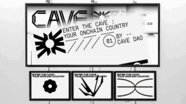
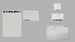
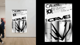
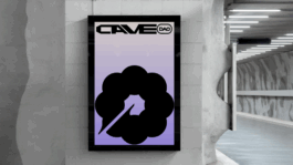
2025
CAVE DAO
Branding / Experience / Digital - coming soon
2021
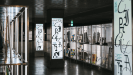
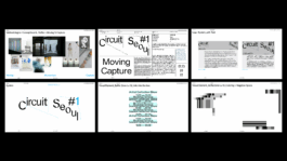
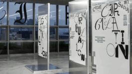
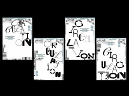
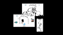
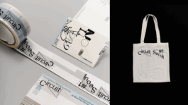
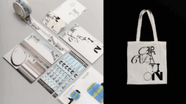
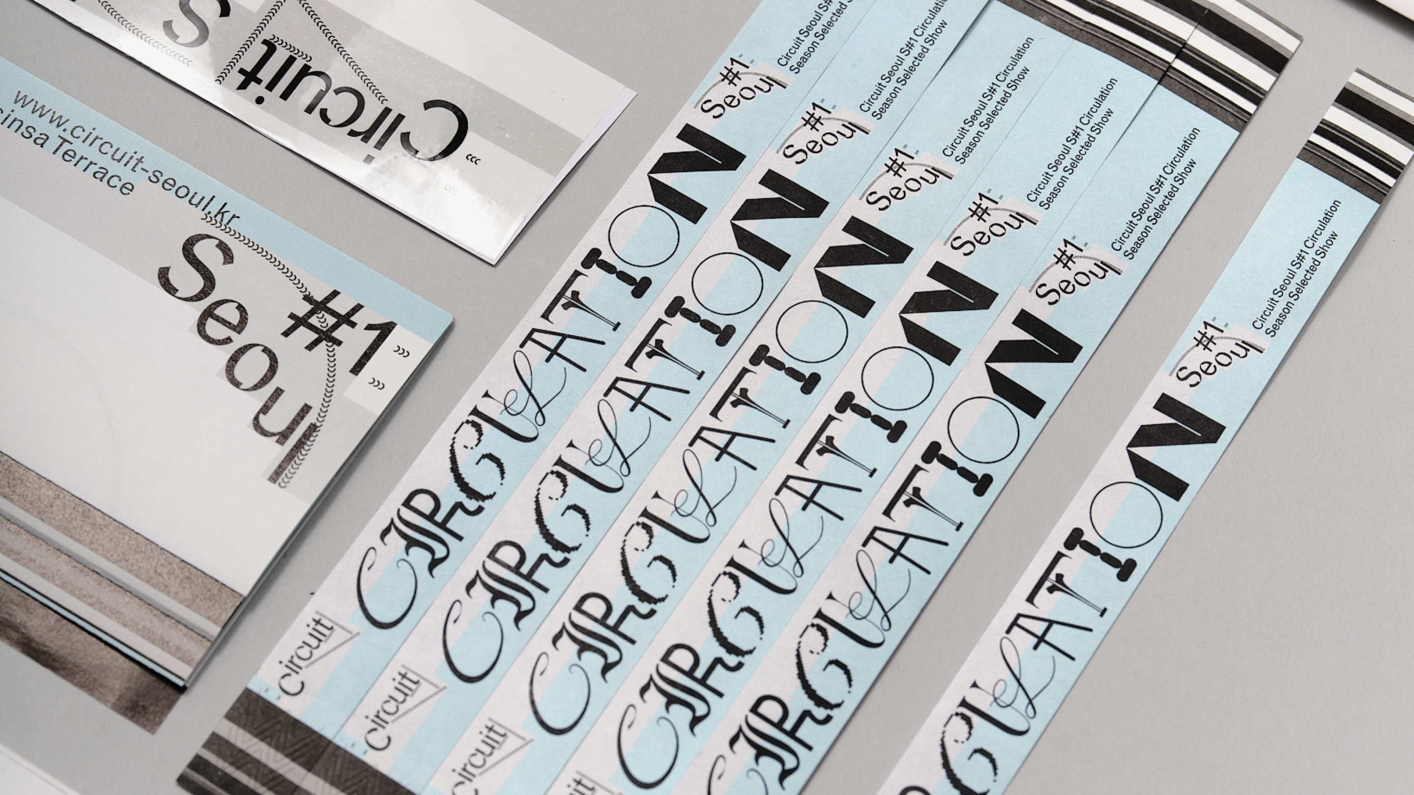
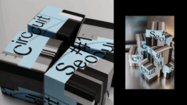
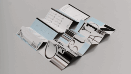
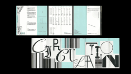
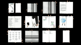
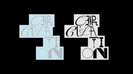
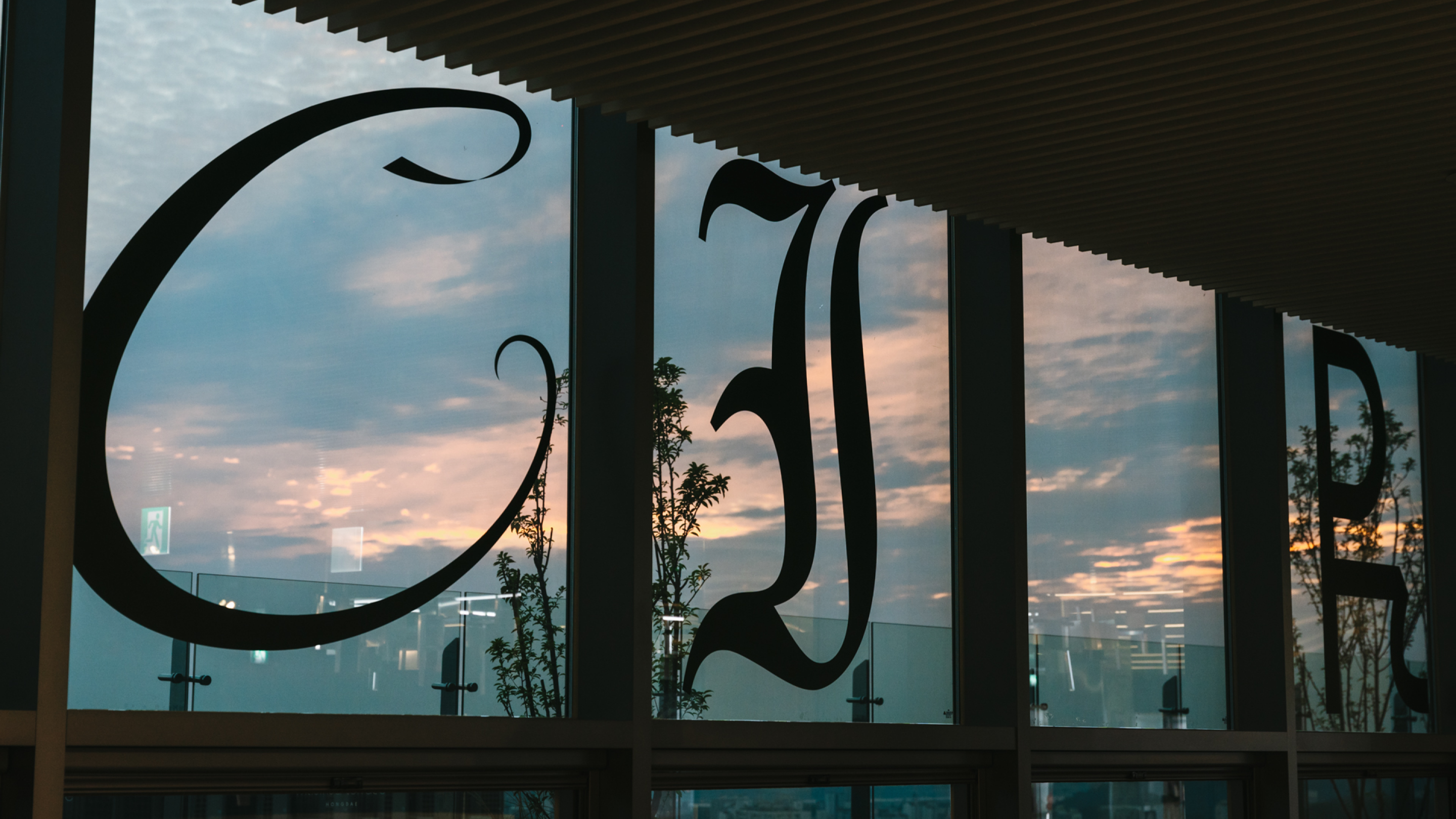
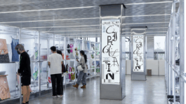
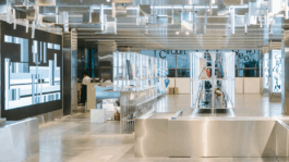
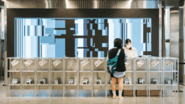
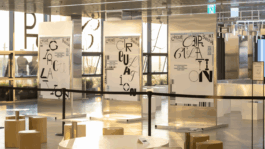
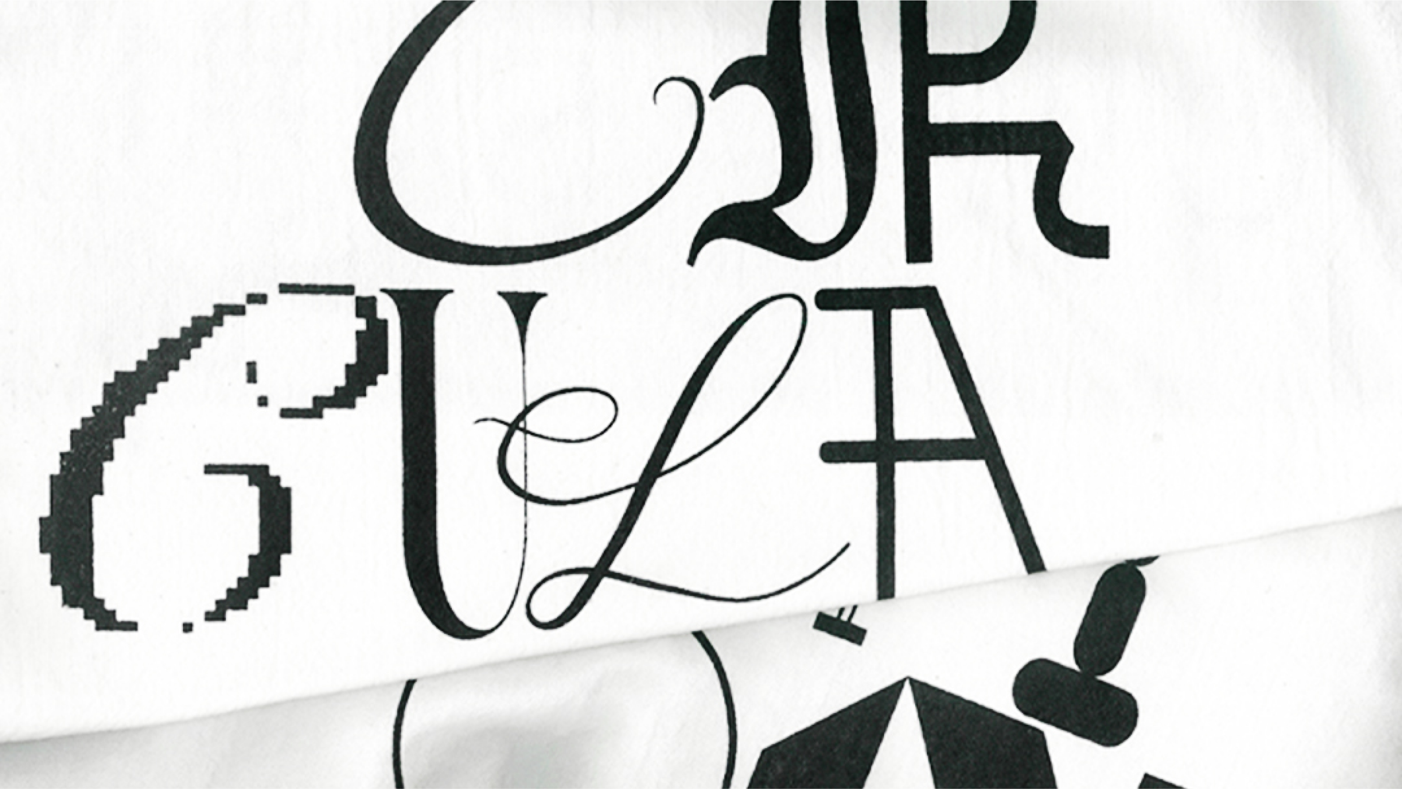
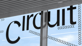
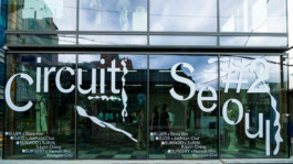
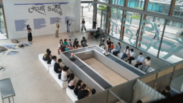
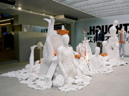
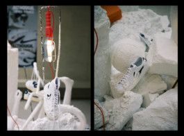
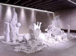
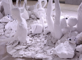
Exhibition Circuit Seoul#1 Circulation
Strategy, Branding, UIUX, Motion, Spatial Design
Circuit Seoul is an experimental exhibition platform inspired by the seasonal rhythm of fashion week, designed to showcase contemporary visual artists in a constantly evolving system. Unlike static institutions, each season introduces a new key visual and reconfigures the logo through shifting graphic elements, making the identity both functional and experimental.
For the first exhibition, Circulation, we developed a custom typographic system that fuses diverse letterforms across eras—creating a visual language of motion, turbulence, and flow. This dynamic treatment, paired with bold compositions and shifting color palettes, symbolizes the idea of the buffer zone: a liminal space where movement and capture, commerce and culture, converge. The result is a living brand identity that resists permanence, instead embodying the cyclical energy of contemporary art in motion.
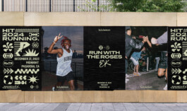
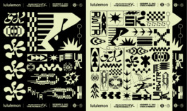
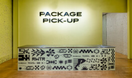
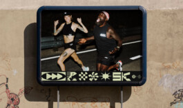
2023-24
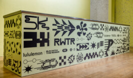
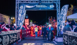
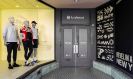
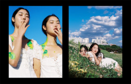
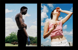
LULULEMON
Event Branding & Graphic
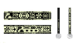
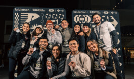
The Lululemon 5K Run with the Roses was envisioned as a midnight race that could capture the cultural energy of Pasadena’s Rose Parade and New Year’s celebrations. Our creative direction translated the spirit of movement and community into a bold graphic system—drawing on run culture’s speed, rhythm, and collective energy. Through kinetic forms, modular symbols, and scalable assets, the identity extended seamlessly across race kits, medals, environmental graphics, merchandise, and digital channels. The result was a unified yet dynamic brand experience for 2,500 participants, turning the event into both a celebration of performance and a shared moment of anticipation for the year ahead.
2023
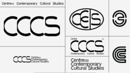
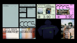
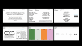
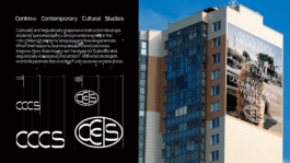
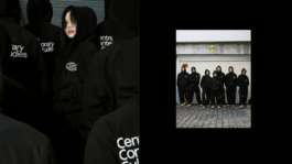
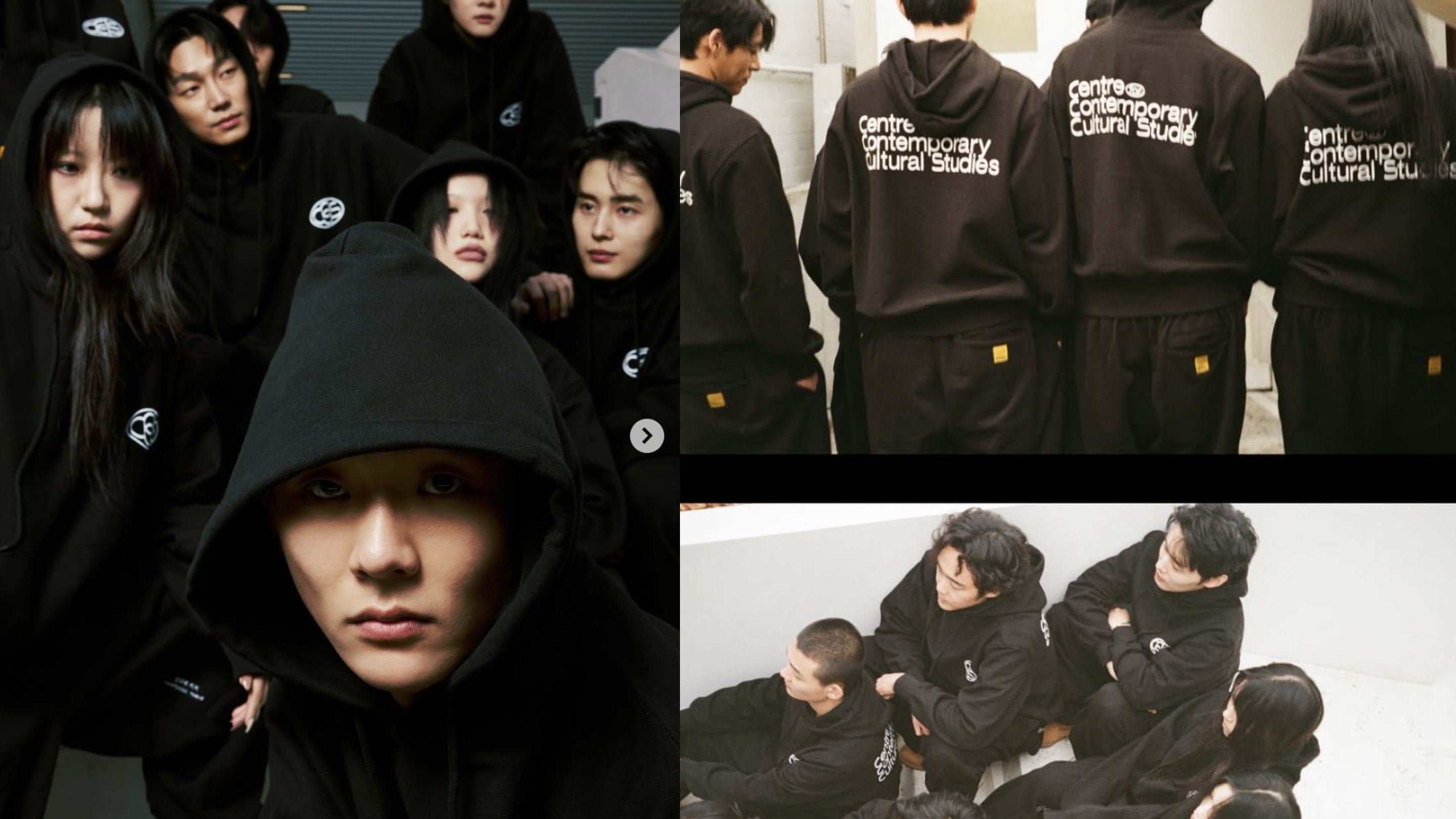
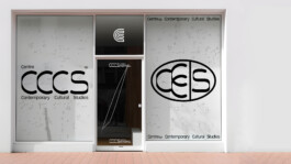
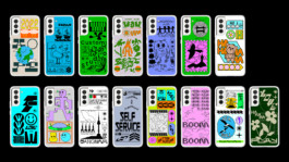
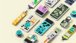
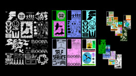
CCCS
Branding, Art Direction, Strategy
The CCCS branding project began with the challenge of articulating a hybrid institution that functioned simultaneously as a cultural archive, retail platform, exhibition space, and community hub, yet lacked a unified identity. Our solution was to design a modular brand system anchored in a bold typographic voice, dynamic grid structures, and a flexible color framework—elements that could fluidly adapt across physical architecture, digital media, editorial, and merchandise without losing consistency. By codifying graphic packs and scalable treatments, the system ensured CCCS could move seamlessly between experimental fashion, cultural discourse, and public engagement. This transformation elevated CCCS beyond being just a multi-use space, positioning it as a forward-driven cultural engine that actively produces dialogue, builds community, and shapes contemporary aesthetics.
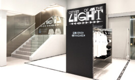
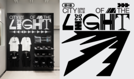
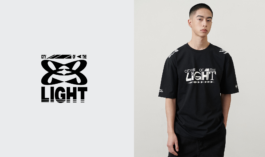
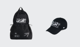
2021
IGHT-PAPER MV
Creative Direction, PD, Art Direction, Graphic
2023
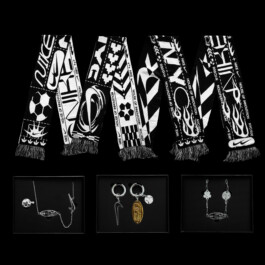
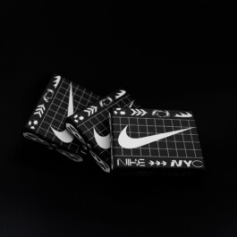
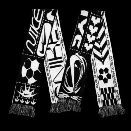
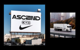
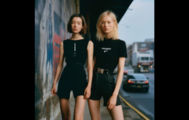
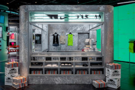
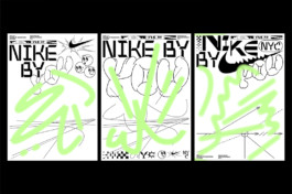
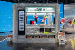
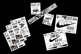
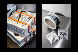
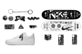
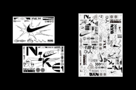
NIKE NYC
WWC collaboration
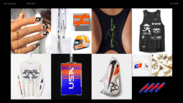
The Nike NYC x Smile Flower project explored how football’s global language can be distilled into graphic symbols and reimagined as collectible, wearable identity pieces. Drawing from the kinetic energy of the Women’s World Cup, the design system translated movement and cultural expression into bold, modular motifs applied across packaging, charms, and merchandise. Gridded compositions, directional forms, and repeated iconography created a visual rhythm that echoed both the structure of the game and the individuality of style. By merging high-performance aesthetics with jewelry-like detailing, the collaboration framed women’s football not only as a sport, but as a cultural force that extends into fashion, self-expression, and everyday identity.
2022
GOD PARTICLE
Art Direction, Photography, Collection Design
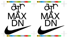
2023-24
NIKE AIRMAX
Graphic Design
2023
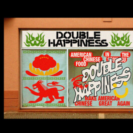
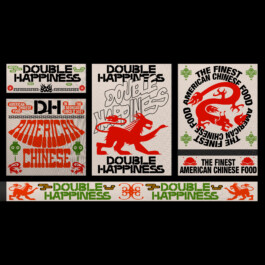
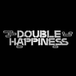
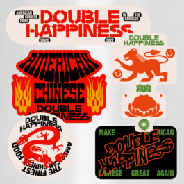
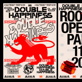
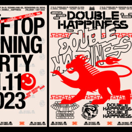
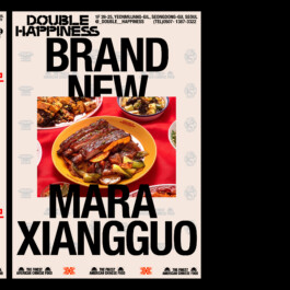
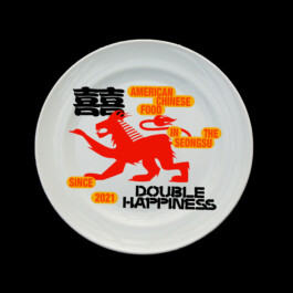
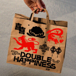
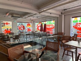
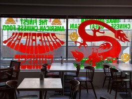
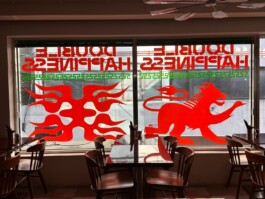
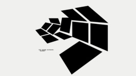
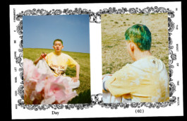
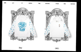
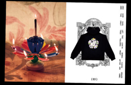
DOUBLE HAPPINESS
Branding, Art Direction
DOUBLE HAPPINESS is a Chinese-American bistro located in Seongsu, Seoul, reimagining the bold, comforting flavors of classic takeout culture with a modern twist. Inspired by the vibrant energy of American Chinese cuisine, DOUBLE HAPPINESS blends nostalgia with contemporary dining, creating a space where tradition meets innovation.
The creative goal is to establish a clear, striking brand identity that reflects the bold, no-nonsense attitude of Chinese-American food culture—simple, punchy, and instantly recognizable. The visual system embraces strong typography, high-contrast colors, and a straightforward logo lockup, ensuring consistency across all brand touchpoints, from signage to packaging.
2023
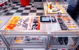
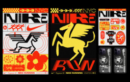
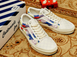
NIKE x Phillip Windly Kim Collaboration for the Pegasus 40
Graphic Design
2023
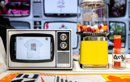
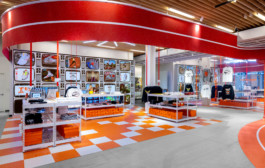
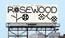
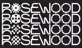
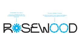
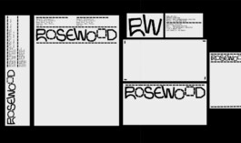
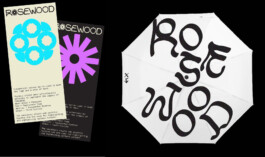
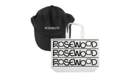
ROSEWOOD
Branding, Art Direction
2023-24 --COMING SOON--
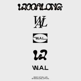
WOOALONG
Branding, Art Direction
2023
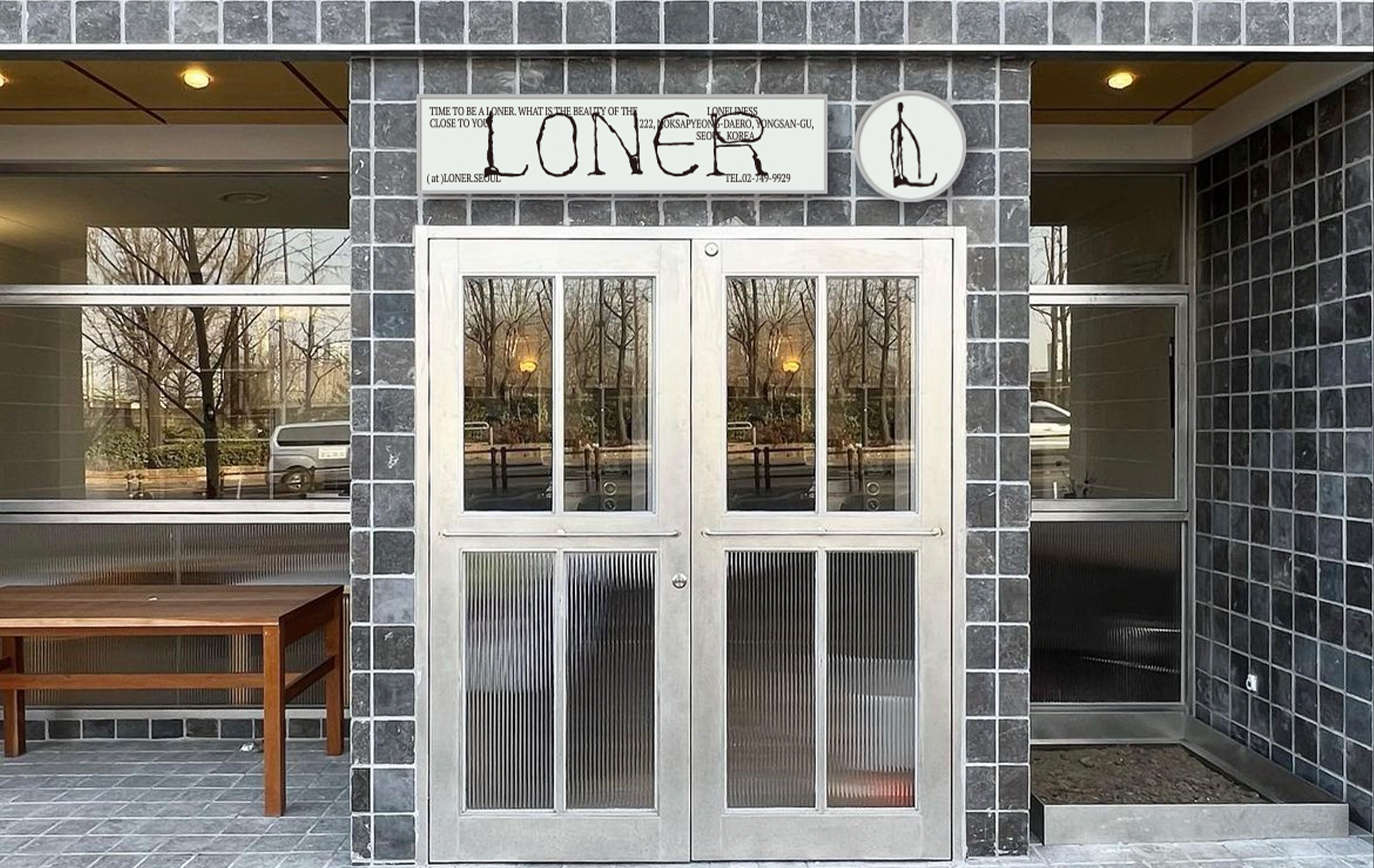
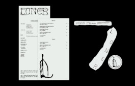
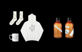
LONER
Branding, Art Direction, Social Contents
2024
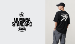
MUSINSA STANDARD x PHILLIP KIM
Graphic Collaboration
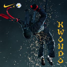
2023
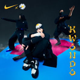
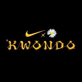
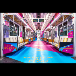
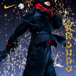
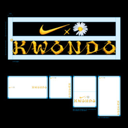
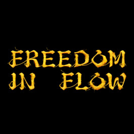
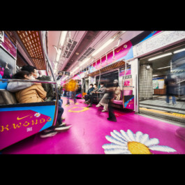
NIKE x KWONDO
Campaign Branding, Graphic Production
2023 -- COMING SOON --
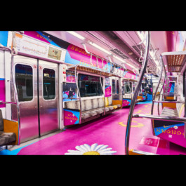
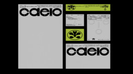
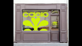
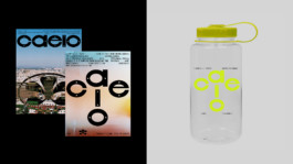
CAELO
Branding, Art Direction, Strategy, Motion, UI&UX, Product
2023
NIKE NYC
Branding, Graphic Design
2022
SAMSUNG
Collaboration
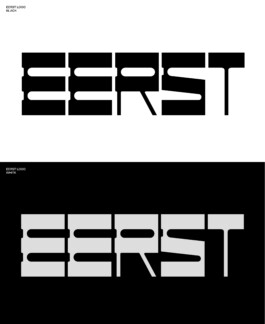
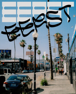
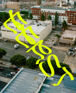
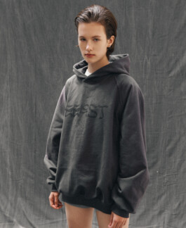
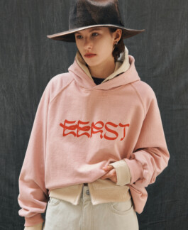
2022
EERST
Branding
2023
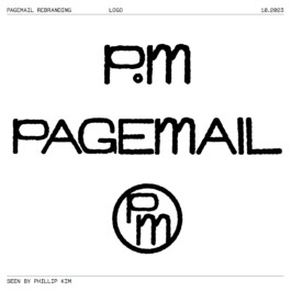
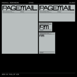
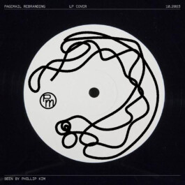
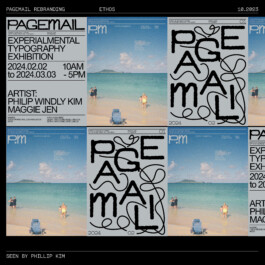
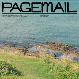
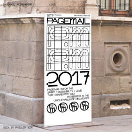
PAGEMAIL
Branding
2022
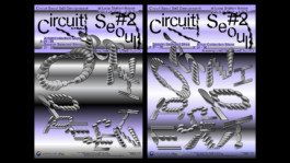
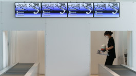
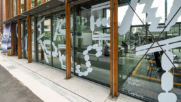
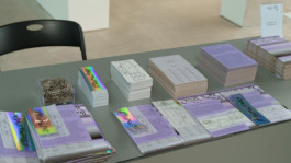
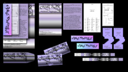
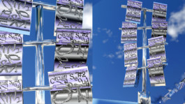
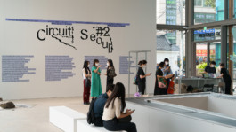
CIRCUIT SEOUL2 EXHIBITION
Branding, Art Direction, Spatial Design
2022
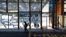
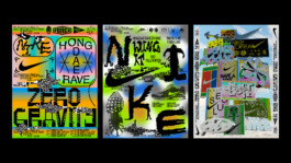
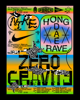
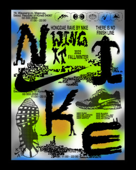
NIKE HONGDAE
Poster Series
2022
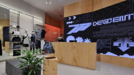
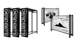
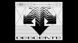
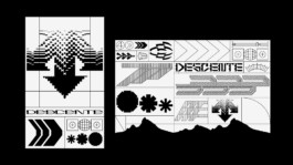
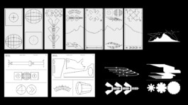
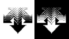
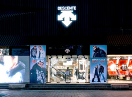
DESCENTE KOREA
Graphic Design, Retail Design
2023
AZUKI - CONFIDENTIAL
Branding, Art Direction, Graphic Design
2021
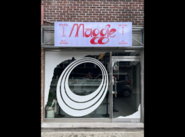
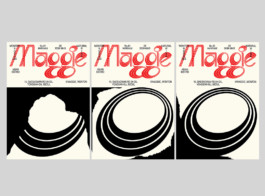
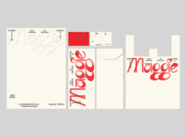
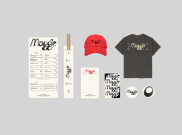
Maggie, Wine Bar+Bistro.
Branding, Art Direction
2021
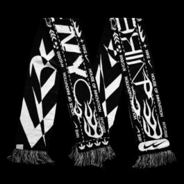
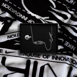
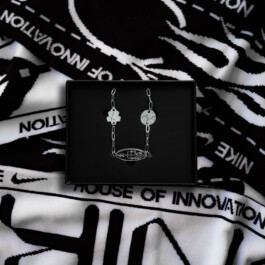
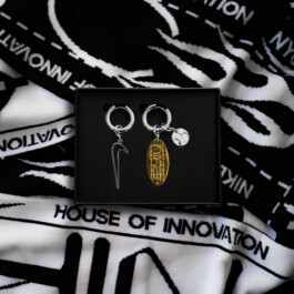
NIKE NYC x Phillip Windly Kim
NBY Collaboration
For the Nike House of Innovation in New York City, this project reinterpreted Nike’s DNA through the lens of the city’s cultural identity. The visual system and key graphics merge symbols of New York with Nike’s iconic design language, creating a hybrid expression that balances luxury and street culture.
The work encompassed the development of key visuals, a scalable design system, and merchandise design—each informed by the dual forces that define the city: polished sophistication and raw urban energy. The result is a unified brand experience that translates New York’s layered cultural landscape into a distinctive expression of global performance fused with local character.

2021
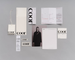
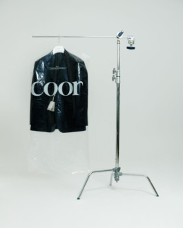
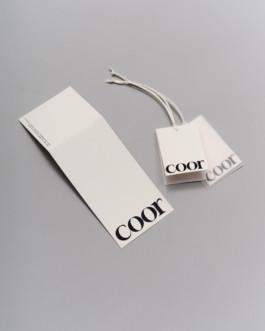
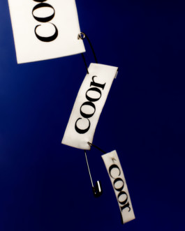
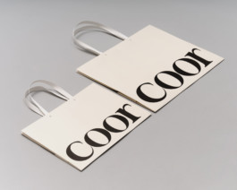
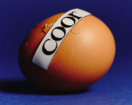
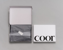
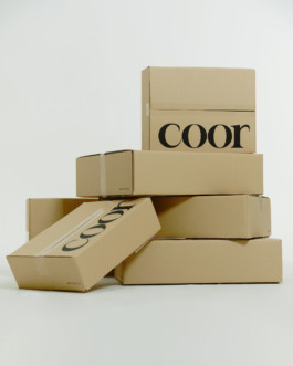
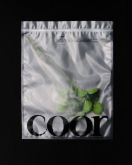
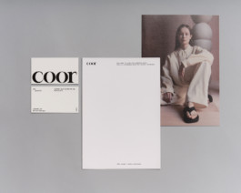
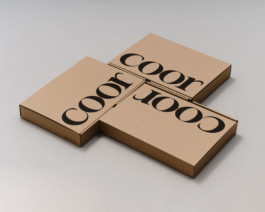
COOR
Branding, Art Direction, Web, Social
COOR is a contemporary menswear brand in Korea, recognized for its refined yet minimal aesthetic. This project redefined the brand identity system while preserving its core philosophy of restraint and modernity.
The new BI system introduced a distinctive serif logotype that reflects the brand’s sharpness and edge, designed for seamless application across packaging, labels, retail, and digital touchpoints. By refining the visual structure and communication strategy, the identity now delivers a stronger, more cohesive presence across both physical and online platforms.
Through strategic execution and close collaboration with the client, the rebrand reinforced COOR’s positioning in the contemporary fashion landscape and established a scalable foundation for future growth.
2021
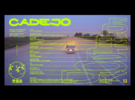
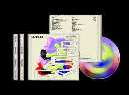
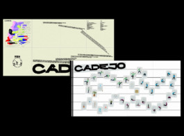
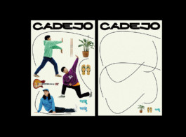
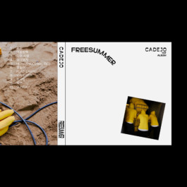
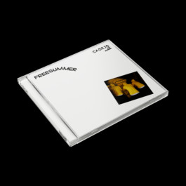
CADEJO BRANDING & MV
Branding, Physical Album Design, MV Direction, Social
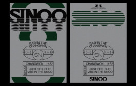
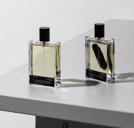
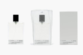
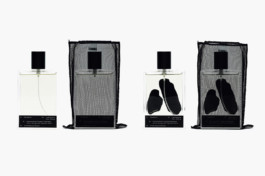
2023
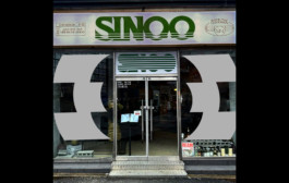
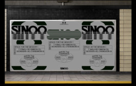
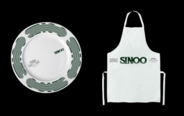
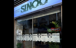
SINOO
Branding
2021
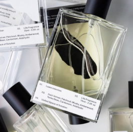
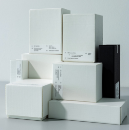
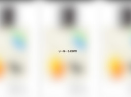
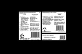
USS, United Space Solution
Branding, Package Design
2020-2021
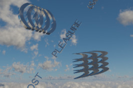
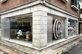
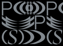
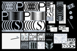
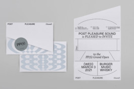
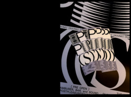
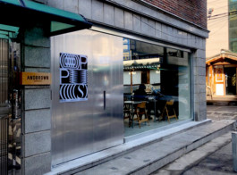
PPS
Branding, Art Direction, Social
PP(S), PostPleasure(Sound) is the bar and bistro located in Seoul, Korea.
The bistro served dry-aging hamburger with special source and selected electronic music.
The forms are from the wave of the sound and pleasure of the good taste.
2020
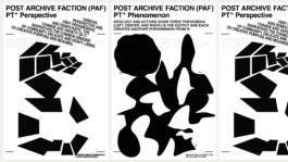
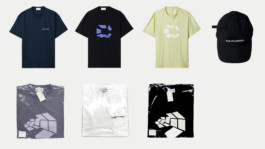
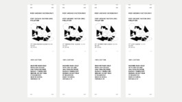
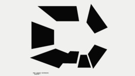
POST ARCHIVE FACTION x PHILLIP KIM
Art Direction, Merch Design
2021
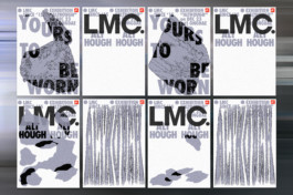
NIKE x LMC Exhibition, Although
Client: LMC
Branding, Art Direction, Installation
2020
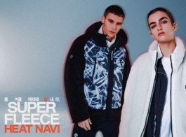
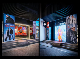
Descente 20FW Campaign
Client: DESCENTE,KR
Project Management, Photo Direction, Branding, Graphic
2023
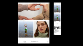
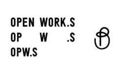
OPWS --COMING SOON--
Branding, UI&UX(E-commerce & APP)
2020
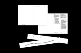
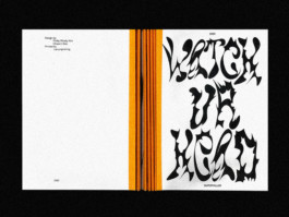
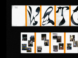
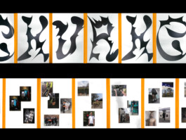
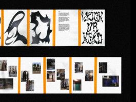
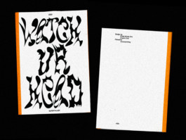
WATCH YOUR HEAD PAMPHLET
EDITORIAL
2020
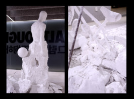
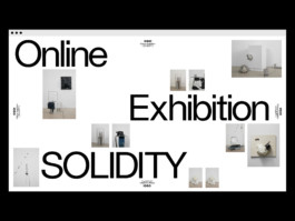
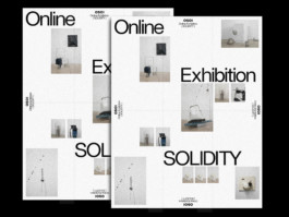
OSOI EXHIBITION "SOLIDITY"
Client: Osoi, KR
DIGITAL EXHIBITION DESIGN
2020
Maker's Mark Digital Editorial
Client: HYPEBEAST, KR
DIGITAL DESIGN


2020
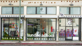
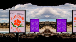
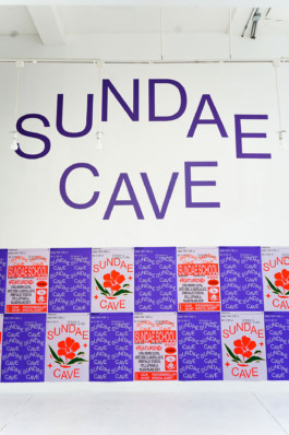
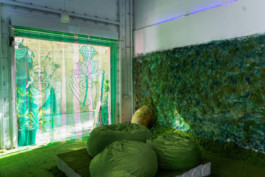
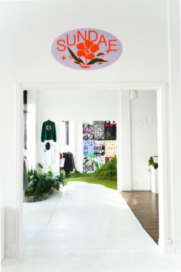
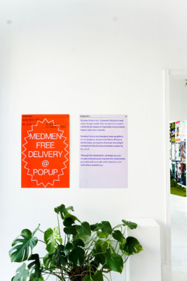
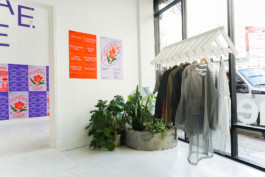
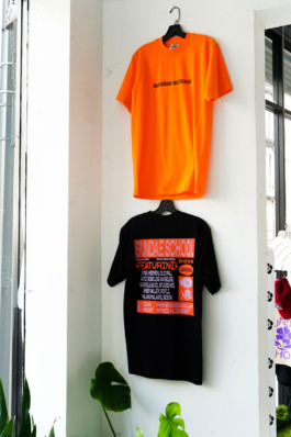
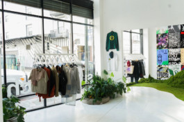
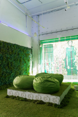
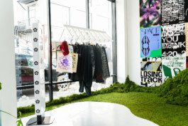
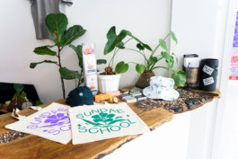
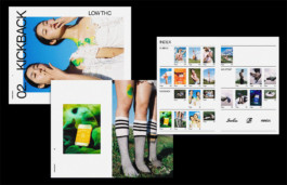
SUNDAE SCHOOL: SUNDAE CAVE LA POPUP STORE
CREATIVE DIRECTION/SPATIAL DESIGN/BRANDING
2020
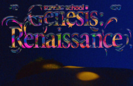
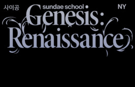
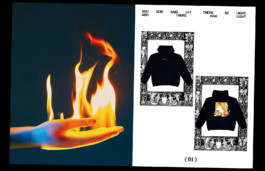
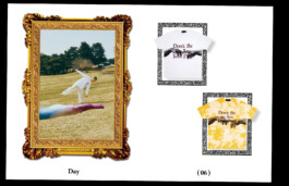
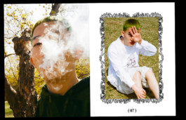
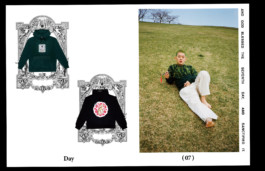
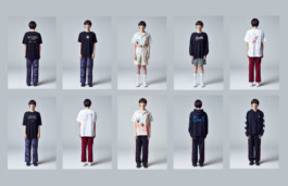
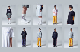
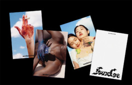
SUNDAE SCHOOL "GENESIS" COLLECTION
CREATIVE DIRECTION/ART DIRECTION/DESIGN


2019
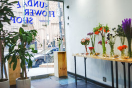
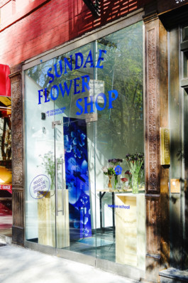
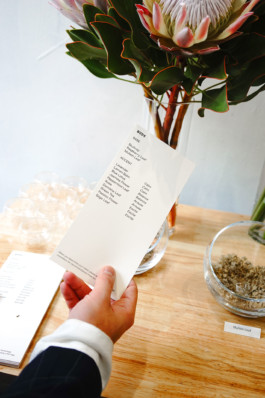
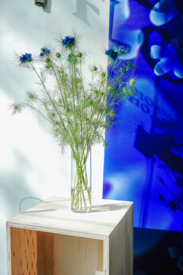
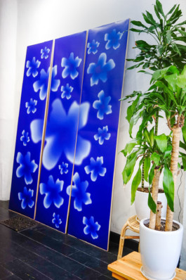
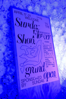
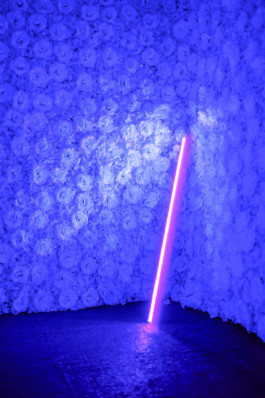
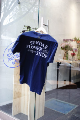
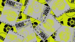
SUNDAE FLOWER SHOP
IDENTITY SYSTEM/SPATIAL DESIGN
2019
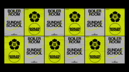
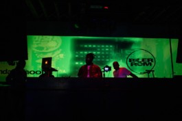
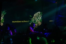
BOILER ROOM X SUNDAE SCHOOL
BRANDING/MOTION/SPATIAL DESIGN
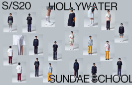
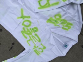
2020
S/S20: HOLY WATER
CREATIVE DIRECTION/FASHION
2019
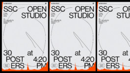
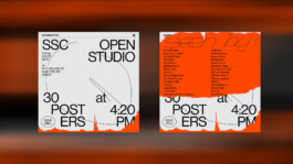
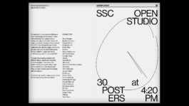
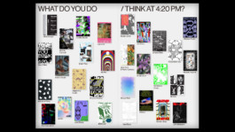
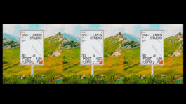
420 POSTER EXHIBITION
STRATEGY, BRANDING
2020
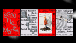
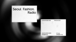
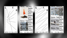
SEOUL FASHION RADIO
BRANDING
2019
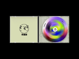
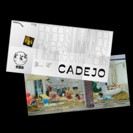
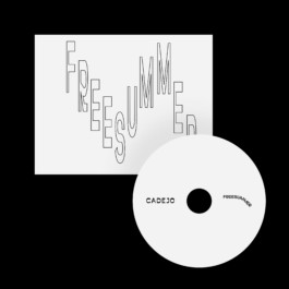
CADEJO 1ST ALBUM "FREEBODY"
ALBUM DESIGN
2019
SUNDAE SCHOOL CANNABIS LAUNCHING CAMPAIGN
PACKAGE DESIGN/ART DIRECT/EDITORIAL
2019
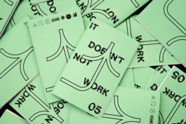
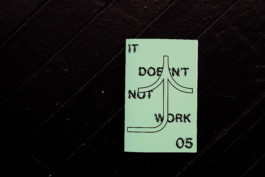
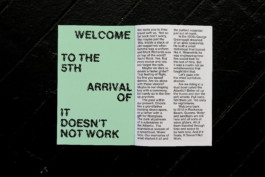
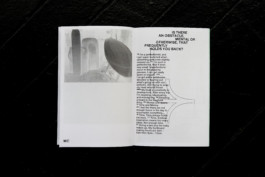
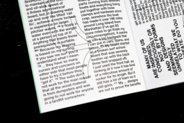
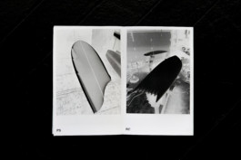
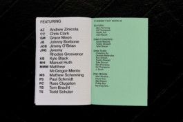
IT DOESN'T NOT WORK ISSUE 05
EDITORIAL
An exuberant, experimental, community-oriented surfboard exhibition, It Doesn’t Not Work is hosted every Spring by Wax friends’ Picture Farm Studios in Williamsburg, Brooklyn. Each year, Wax works with Picture Farm to the author and produces a catalog ‘zine that captures the spirit and craft of the corresponding show. The form of each zine often matches the idiosyncrasy of the surf craft — handmade, unexpected, and unique.
2017
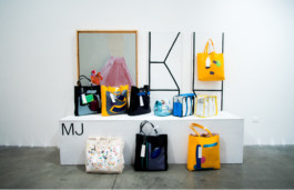
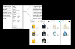
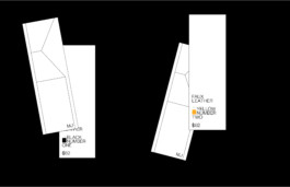
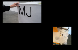
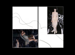
MJ SOLO EXHIBITION
MJ POPUP is the exhibition of Minjoo Lee, who is a fine artist, based in Los Angeles. Conversion of the canvas is the main thesis of this exhibition. The identity system united artworks in a voice and communicate the artist's ethos and message unconsciously. It gives the ironic to the people by showcase the solid grid system with abstract painting on the bag(as a canvas)


2018
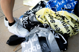
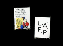
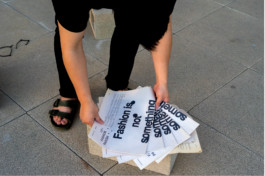
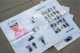
<SELF INITIATED PROJECT>
LAFP: LOS ANGELES FASHION PARISH
BRANDING/EDITORIAL
LAFP is the new name of LA FASHION DISTRICT. LAFP is an innovative district for people interested in fashion and starting their creativity. LAFP has 4 districts that represent brands, manufacturers, select shops, and shows. Each of the districts has a code and color. LAFD helps Fashion Designers/Startup brands to promote themselves. People can experience different levels of brands and cultures. Fashion is not just a beauty of the surface, more than that, it is an expression and language of one’s ideas, culture, and identities. Through the LAFP, people can experience and communicate with other cultures and identities. Also, they will be educated in different kinds of cultures and start to understand others.
2018
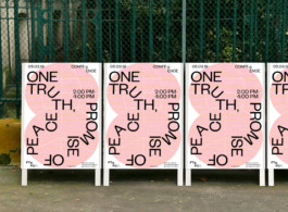
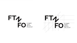
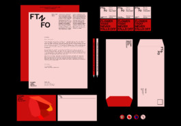
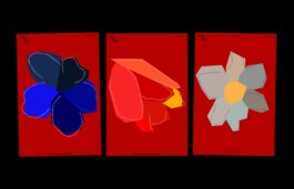
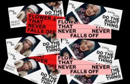
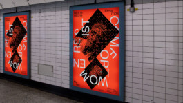
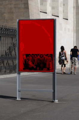
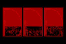
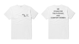
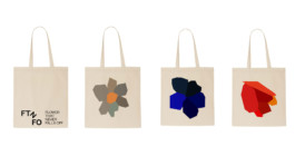
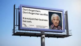
FTNFO: FLOWER THAT NEVER FALLS OFF
BRANDING/EDITORIAL/UI&UX/EXHIBITION/INSTALLATION
FTNFO: Flower That Never Falls Off is an international non-profit organization raising awareness for the fate of so-called comfort women, i.e. women and girls forced into sexual slavery by the Imperial Japanese Army in occupied territories before and during World War II. The term “comfort women” is a translation of the Japanese ianfu, a euphemism for prostitutes.
FTNFO represents the human rights of the victims of the war and deals with the repetition of the same mistakes in the future by educating people about our history. To stand for comfort women, two graphic languages are used consistently. One is the simple shape of the flower. As each flower has a unique message of youth and Beauty. And by rotating type as treatment, It poetically visualizes comfort women’s message.


2017
<SELF INITIATED PROJECT>
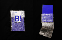
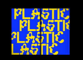
BANALITY MAGAZINE
BRANDING/EDITORIAL
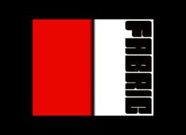
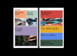
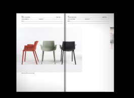
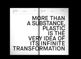
Banality magazine is about Materials. Every issue is introduced and curated in different uses and perspectives within selected materials for designers. The abundance of concrete, glass, textiles, metals, and other materials can form civilization. Materials are invented and made by humans, but on the contrary, the material makes us human beings.
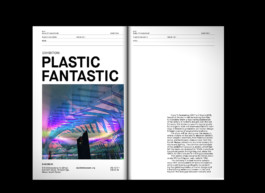
Issue01: Plastic
Issue02: Fabric
2018
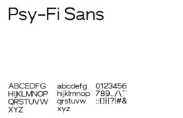
PSY FI SANS
FONT DESIGN
Psy-Fi Sans is the open sans that the form is inspired by high technology hardware, with medium weight, low contrast, and wide. Psy-Fi Sans is used for science and technology magazines, editorials, displays, and identity. Psy-Fi Sans has a unique relationship between letters as rt / ae / sa / rf / ra.
PHILLIP WINDLY GEEM
BASED IN SAN FRANCISCO
CURRENTLY AT GOOGLE LAB & SMILE FLOWER STUDIO
PREVIOUSLY AT OPEN AI, NIKE, WIEDEN+KENNEDY, NEED, 2x4, WAX STUDIOS, CJ ENM
SELECTED WORKS:
PHILLIPKIM0503@GMAIL.COM
@PHILLIP.WINDLY
CREATIVE SERVICES:
BRANDING, CREATIVE DIRECTION, UI/UX, AI CREATIVE, AND ART DIRECTION
2022
NIKE KOREA
Branding, Art Direction
2025
NEED
Creative Direction, Rebranding, Art Direction, Product Design, Digital Design, Illustration, 3D
2024
NIKE AIR
Branding, Graphic
2023-24
LULULEMON
Event Branding & Graphic
2023
NIKE NYC
WWC collaboration
2023-24
NIKE AIRMAX
Graphic Design
2023
DOUBLE HAPPINESS
Branding, Art Direction
2023
ROSEWOOD
Branding, Art Direction
2023-24 --COMING SOON--
WOOALONG
Branding, Art Direction
2023
NIKE x Phillip Windly Kim Collaboration for the Pegasus 40
Graphic Design
2023
LONER
Branding, Art Direction, Social Contents
2024
MUSINSA STANDARD x PHILLIP KIM
Graphic Collaboration
2023
NIKE x KWONDO
Campaign Branding, Graphic Production
2023 -- COMING SOON --
CAELO
Branding, Art Direction, Strategy, Motion, UI&UX, Product
2023
NIKE NYC
Branding, Graphic Design
2022
SAMSUNG
Collaboration
2022
EERST
Branding
2023
PAGEMAIL
Branding
2022
CIRCUIT SEOUL2 EXHIBITION
Branding, Art Direction, Spatial Design
2022
NIKE HONGDAE
Poster Series
2022
DESCENTE KOREA
Graphic Design, Retail Design
2021
Maggie, Wine Bar+Bistro.
Branding, Art Direction
2021
NIKE NYC x Phillip Windly Kim
NBY Collaboration
2021
COOR
Branding, Art Direction, Web, Social
2023
SINOO
Branding
2020-2021
PPS
Branding, Art Direction, Social
PP(S), PostPleasure(Sound) is the bar and bistro located in Seoul, Korea.
The bistro served dry-aging hamburger with special source and selected electronic music.
The forms are from the wave of the sound and pleasure of the good taste.
2020
POST ARCHIVE FACTION x PHILLIP KIM
Art Direction, Merch Design
2021
NIKE x LMC Exhibition, Although
Client: LMC
Branding, Art Direction, Installation
2020
WATCH YOUR HEAD PAMPHLET
EDITORIAL
2023
OPWS --COMING SOON--
Branding, UI&UX(E-commerce & APP)
2020
Descente 20FW Campaign
Client: DESCENTE,KR
Project Management, Photo Direction, Branding, Graphic
2020
OSOI EXHIBITION "SOLIDITY"
Client: Osoi, KR
DIGITAL EXHIBITION DESIGN
2020
Maker's Mark Digital Editorial
Client: HYPEBEAST, KR
DIGITAL DESIGN
2020
SUNDAE SCHOOL: SUNDAE CAVE LA POPUP STORE
CREATIVE DIRECTION/SPATIAL DESIGN/BRANDING
2020
SUNDAE SCHOOL "GENESIS" COLLECTION
CREATIVE DIRECTION/ART DIRECTION/DESIGN
2019
SUNDAE FLOWER SHOP
IDENTITY SYSTEM/SPATIAL DESIGN
2019
BOILER ROOM X SUNDAE SCHOOL
BRANDING/MOTION/SPATIAL DESIGN
2020
S/S20: HOLY WATER
CREATIVE DIRECTION/FASHION
2019
420 POSTER EXHIBITION
STRATEGY, BRANDING
2020
SEOUL FASHION RADIO
BRANDING
2019
CADEJO 1ST ALBUM "FREEBODY"
ALBUM DESIGN
2019
SUNDAE SCHOOL CANNABIS LAUNCHING CAMPAIGN
PACKAGE DESIGN/ART DIRECT/EDITORIAL
2019
IT DOESN'T NOT WORK ISSUE 05
EDITORIAL
An exuberant, experimental, community-oriented surfboard exhibition, It Doesn’t Not Work is hosted every Spring by Wax friends’ Picture Farm Studios in Williamsburg, Brooklyn. Each year, Wax works with Picture Farm to the author and produces a catalog ‘zine that captures the spirit and craft of the corresponding show. The form of each zine often matches the idiosyncrasy of the surf craft — handmade, unexpected, and unique.
2017
MJ SOLO EXHIBITION
MJ POPUP is the exhibition of Minjoo Lee, who is a fine artist, based in Los Angeles. Conversion of the canvas is the main thesis of this exhibition. The identity system united artworks in a voice and communicate the artist's ethos and message unconsciously. It gives the ironic to the people by showcase the solid grid system with abstract painting on the bag(as a canvas)
2018
<SELF INITIATED PROJECT>
LAFP: LOS ANGELES FASHION PARISH
BRANDING/EDITORIAL
LAFP is the new name of LA FASHION DISTRICT. LAFP is an innovative district for people interested in fashion and starting their creativity. LAFP has 4 districts that represent brands, manufacturers, select shops, and shows. Each of the districts has a code and color. LAFD helps Fashion Designers/Startup brands to promote themselves. People can experience different levels of brands and cultures. Fashion is not just a beauty of the surface, more than that, it is an expression and language of one’s ideas, culture, and identities. Through the LAFP, people can experience and communicate with other cultures and identities. Also, they will be educated in different kinds of cultures and start to understand others.
2018
FTNFO: FLOWER THAT NEVER FALLS OFF
BRANDING/EDITORIAL/UI&UX/EXHIBITION/INSTALLATION
FTNFO: Flower That Never Falls Off is an international non-profit organization raising awareness for the fate of so-called comfort women, i.e. women and girls forced into sexual slavery by the Imperial Japanese Army in occupied territories before and during World War II. The term “comfort women” is a translation of the Japanese ianfu, a euphemism for prostitutes.
FTNFO represents the human rights of the victims of the war and deals with the repetition of the same mistakes in the future by educating people about our history. To stand for comfort women, two graphic languages are used consistently. One is the simple shape of the flower. As each flower has a unique message of youth and Beauty. And by rotating type as treatment, It poetically visualizes comfort women’s message.
2017
<SELF INITIATED PROJECT>
BANALITY MAGAZINE
BRANDING/EDITORIAL
Banality magazine is about Materials. Every issue is introduced and curated in different uses and perspectives within selected materials for designers. The abundance of concrete, glass, textiles, metals, and other materials can form civilization. Materials are invented and made by humans, but on the contrary, the material makes us human beings.
Issue01: Plastic
Issue02: Fabric
2018
PSY FI SANS
FONT DESIGN
Psy-Fi Sans is the open sans that the form is inspired by high technology hardware, with medium weight, low contrast, and wide. Psy-Fi Sans is used for science and technology magazines, editorials, displays, and identity. Psy-Fi Sans has a unique relationship between letters as rt / ae / sa / rf / ra.