BASED IN SAN FRANCISCO
PHILLIPKIM0503@GMAIL.COM
SELECTED WORKS:
CREATIVE SERVICES:
BRANDING, DIGITAL DESIGN, UIUX, CREATIVE DIRECTION, ART DIRECTION, and PHOTOGRAPHY


2022
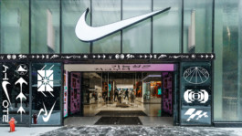
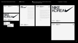
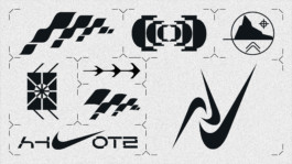
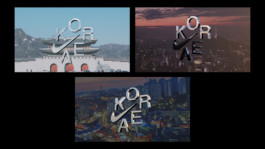
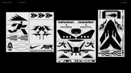
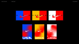
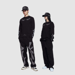
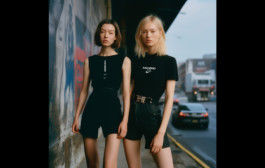
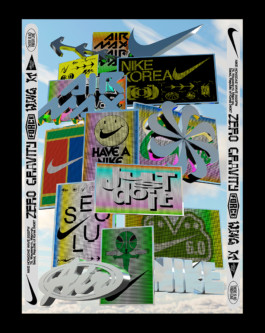
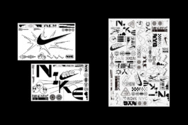
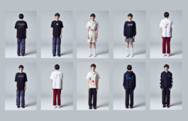
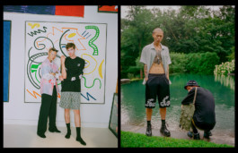
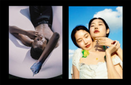
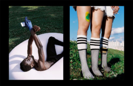
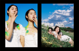
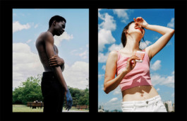
NIKE KOREA
Branding, Art Direction
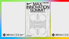
2023
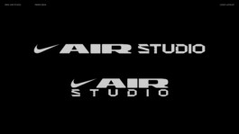
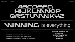
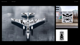
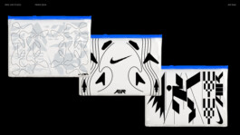
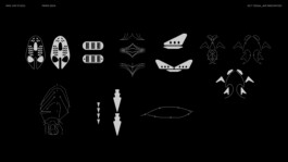
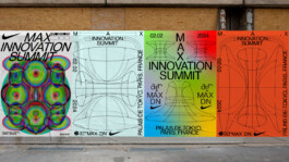
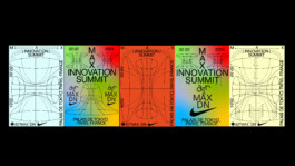
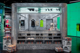
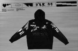
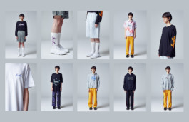
NIKE AIR STUDIO
Branding, Key visual
2024-Present
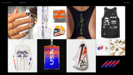
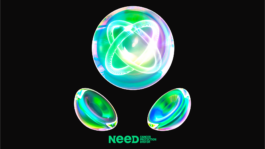
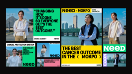
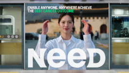
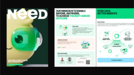
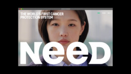
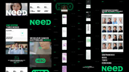
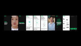
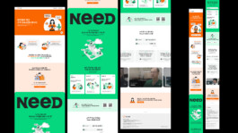
Need inc
Creative Direction, Branding, Art Direction, Digital Design, UIUX, Marketing, and more
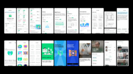
2025
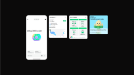
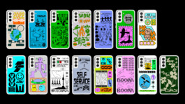
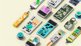
Need inc
Need web&mobile design & Art Direction
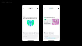
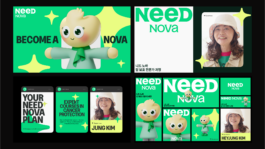
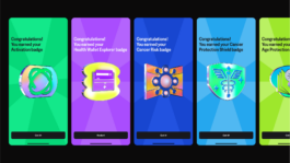
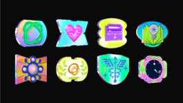
2025
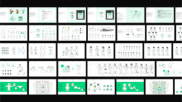
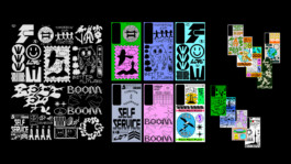
Need inc
UIUX & Design System
2021
IGHT-PAPER MV
Creative Direction, PD, Art Direction, Graphic
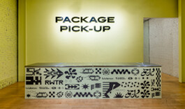
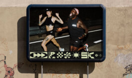
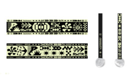
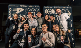
2023-24
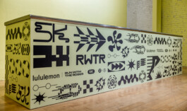
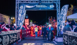
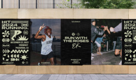
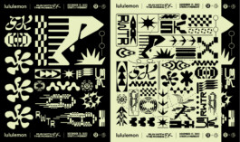
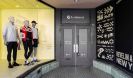
LULULEMON
Event Branding & Graphic
2023
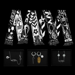
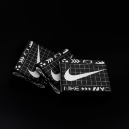
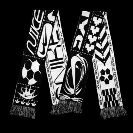
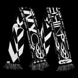
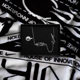
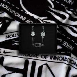
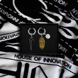
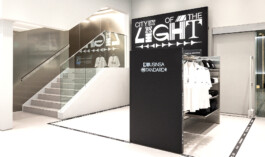
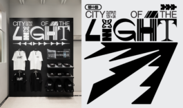
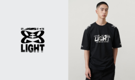
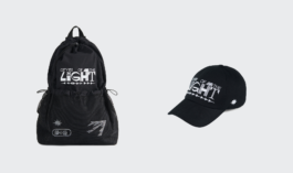
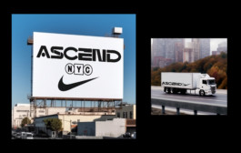
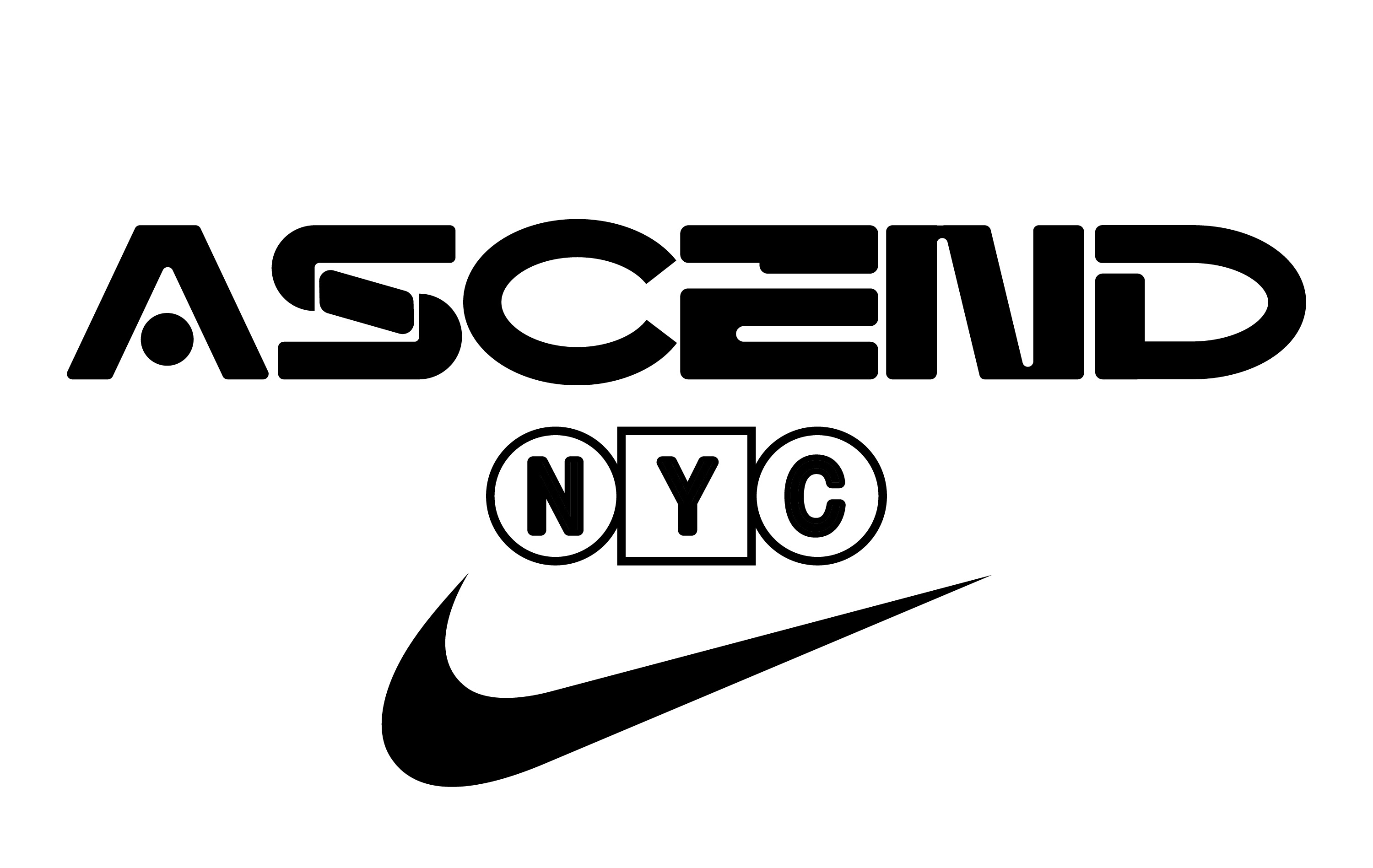
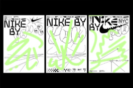
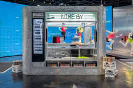
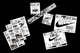
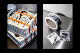
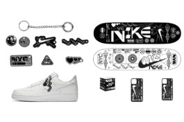
NIKE NYC
WWC collaboration
2022
GOD PARTICLE
Art Direction, Photography, Collection Design
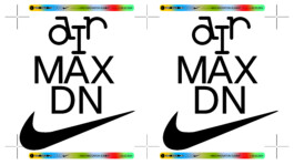
2023-24
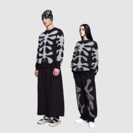
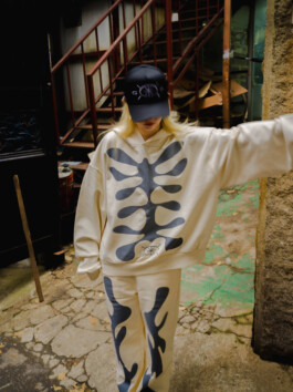
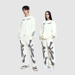
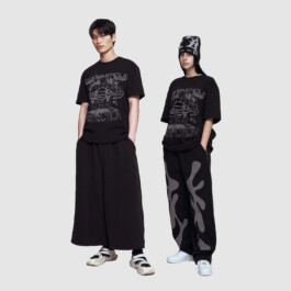
NIKE AIRMAX
Graphic Design
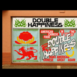
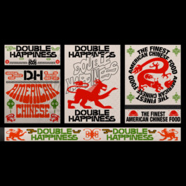
2023
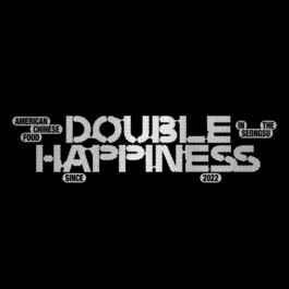
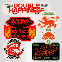
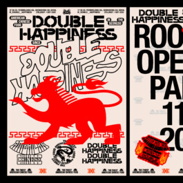
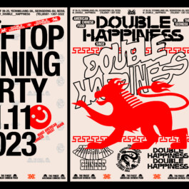
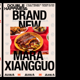
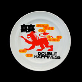
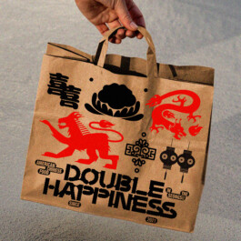
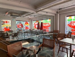
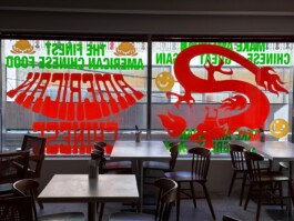
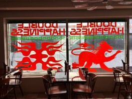
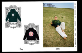
DOUBLE HAPPINESS
Branding, Art Direction
2023
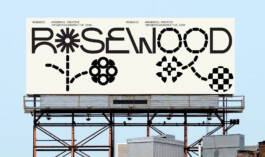
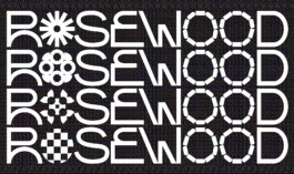
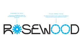
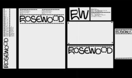
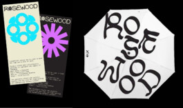
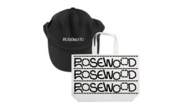
ROSEWOOD
Branding, Art Direction
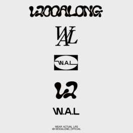
2023-24 --COMING SOON--
WOOALONG
Branding, Art Direction
2023
NIKE x Phillip Windly Kim Collaboration for the Pegasus 40
Graphic Design
2023
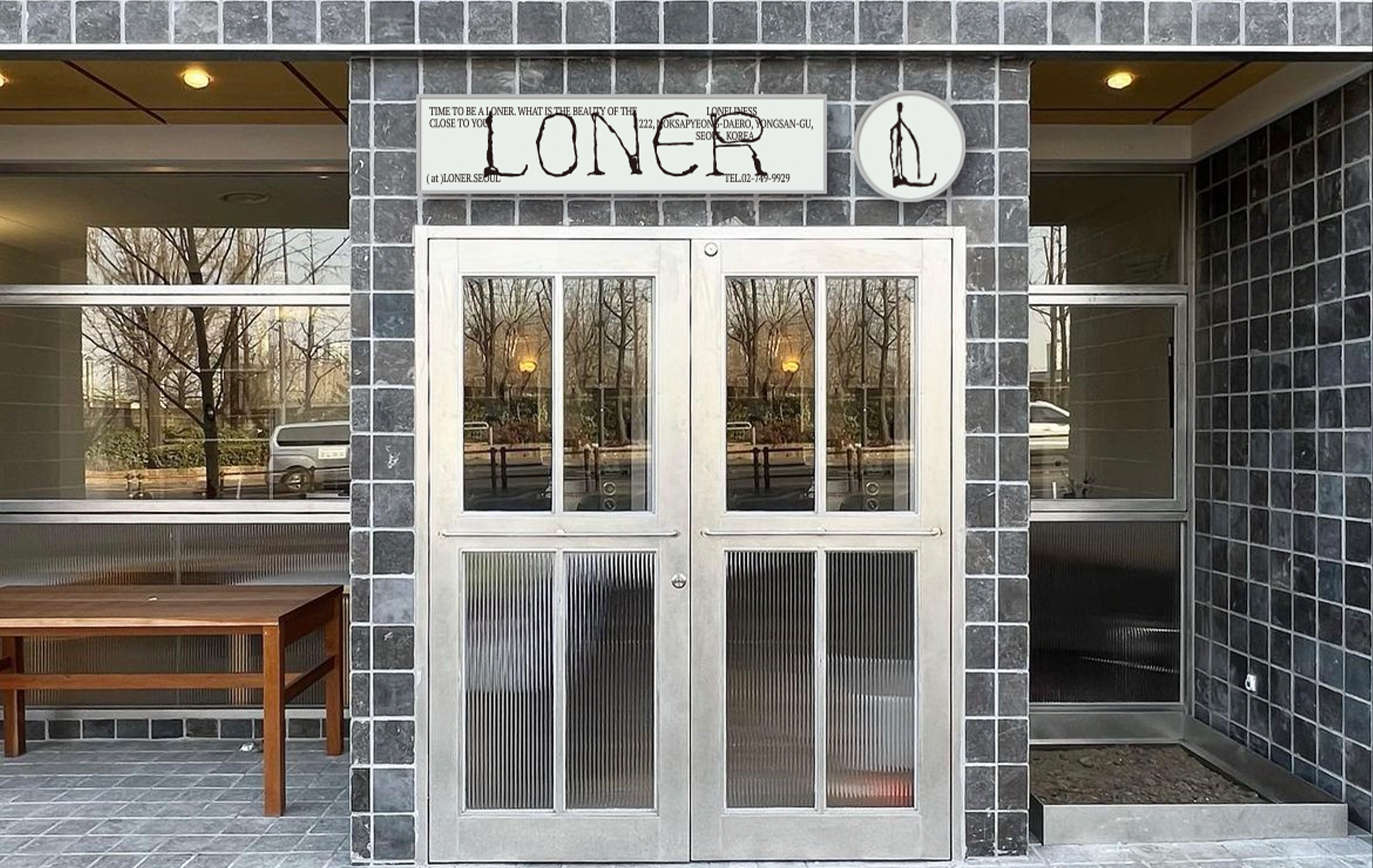
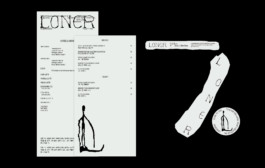
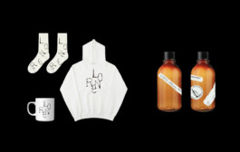
LONER
Branding, Art Direction, Social Contents
2024
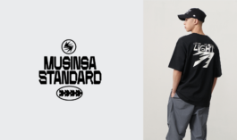
MUSINSA STANDARD x PHILLIP KI<
Graphic Collaboration
2023 -- COMING SOON --
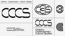
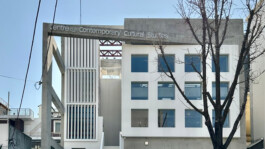
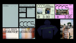
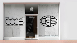
CCCS
Branding, Art Direction, Strategy
2023
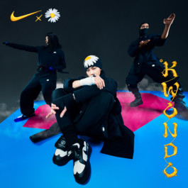
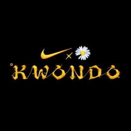
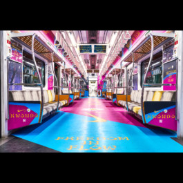
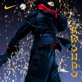
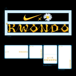
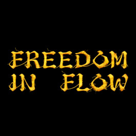
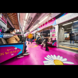
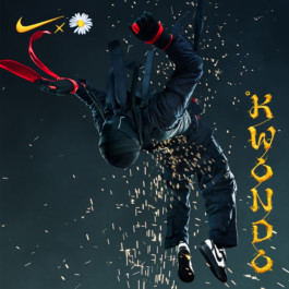
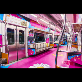
NIKE x KWONDO
Campaign Branding, Graphic Production
2023 -- COMING SOON --
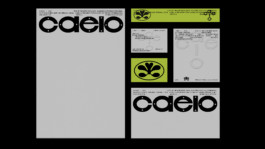
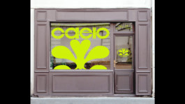
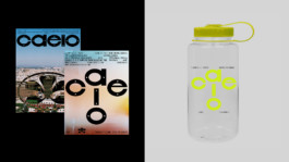
CAELO
Branding, Art Direction, Strategy, Motion, UI&UX, Product
2023
NIKE NYC
Branding, Graphic Design
2022
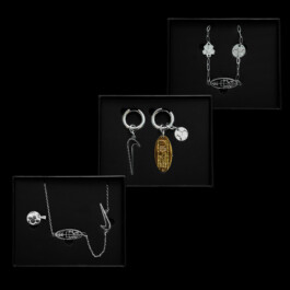
SAMSUNG
Collaboration
2022
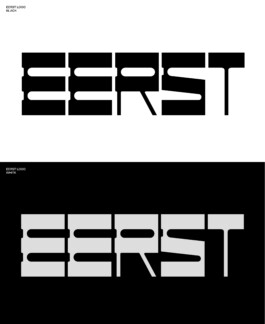
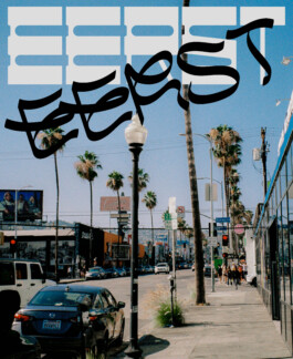
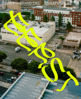
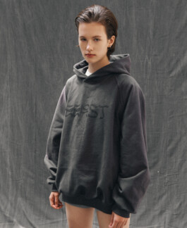
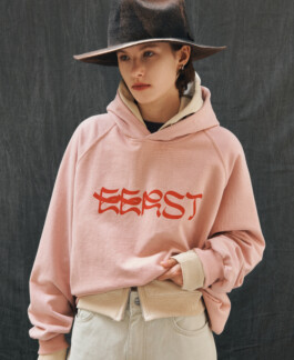
EERST
Branding
2023
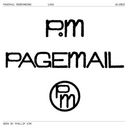
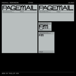
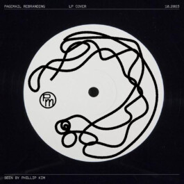
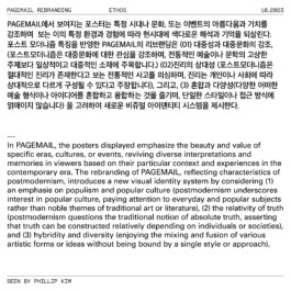
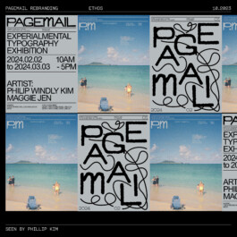
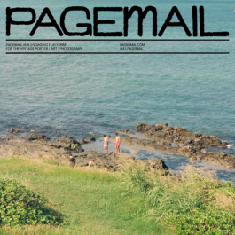
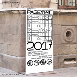
PAGEMAIL
Branding
2022
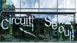
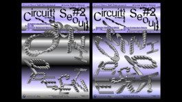
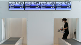
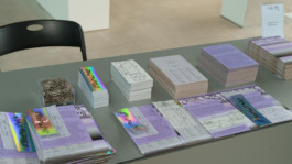
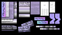
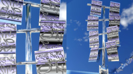
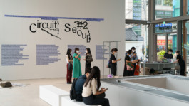
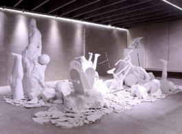
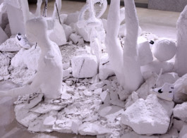
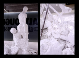
CIRCUIT SEOUL2 EXHIBITION
Branding, Art Direction, Spatial Design
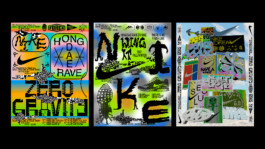
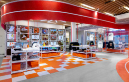
2022
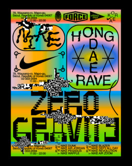
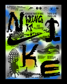
NIKE HONGDAE
Poster Series
2022
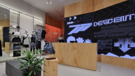
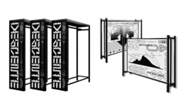
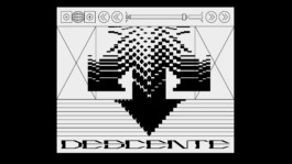
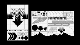
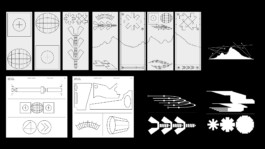
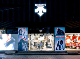
DESCENTE KOREA
Graphic Design, Retail Design
2023
AZUKI
Art Direction, Graphic Design
2021
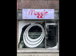
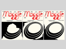
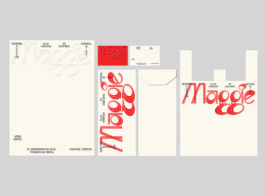
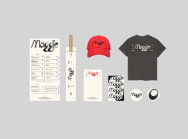
Maggie, Wine Bar+Bistro.
Branding, Art Direction
2021
NIKE NYC x Phillip Windly Kim
NBY Collaboration

2021
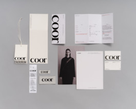
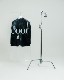
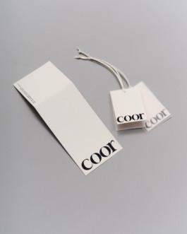
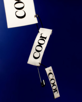
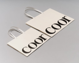
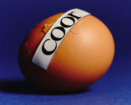
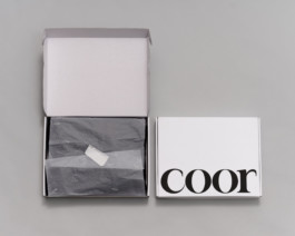
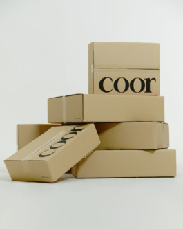
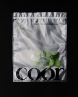
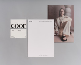
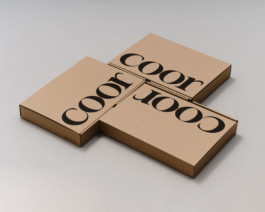
COOR
Branding, Art Direction, Web, Social


2021
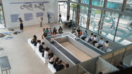
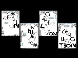
Exhibition Circuit Seoul#1 Circulation
Strategy, Branding, UIUX, Motion, Spatial Design
2023
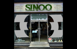
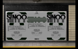
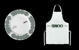
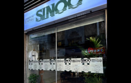
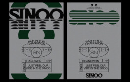
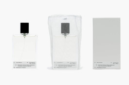
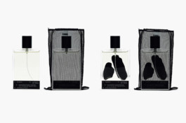
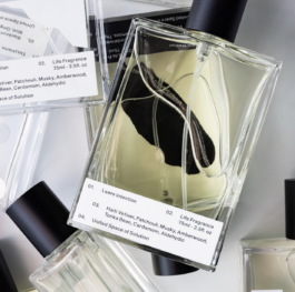
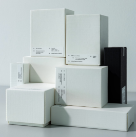
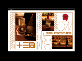
SINOO
Branding
2021
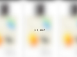
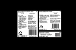
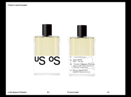
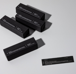
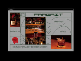
USS, United Space Solution
Branding, Package Design
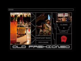
2020-2021
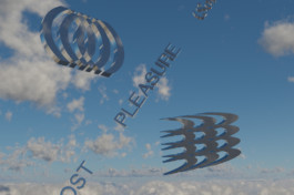
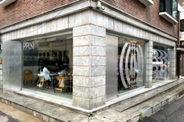
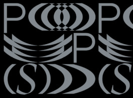
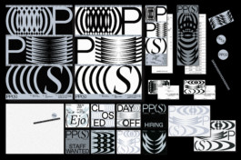
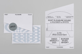
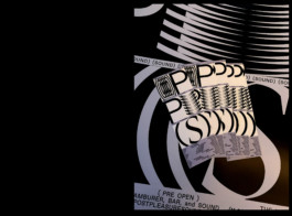
PPS
Branding, Art Direction, Social
PP(S), PostPleasure(Sound) is the bar and bistro located in Seoul, Korea.
The bistro served dry-aging hamburger with special source and selected electronic music.
The forms are from the wave of the sound and pleasure of the good taste.
2020
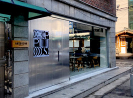
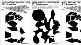
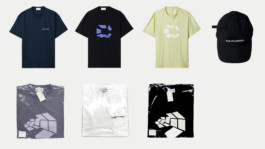
POST ARCHIVE FACTION x PHILLIP KIM
Art Direction, Merch Design
2021
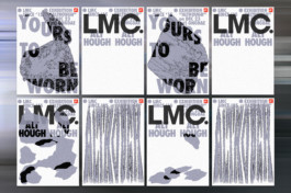
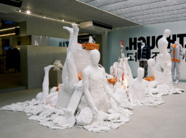
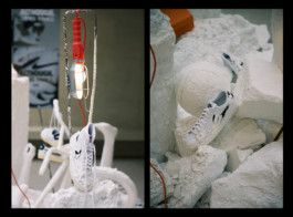
NIKE x LMC Exhibition, Although
Client: LMC
Branding, Art Direction, Installation
2021
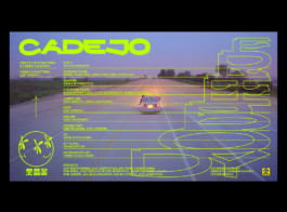
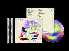
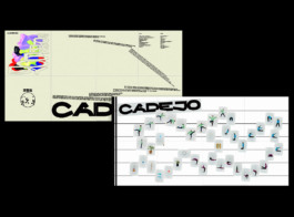
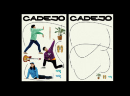
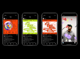
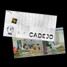
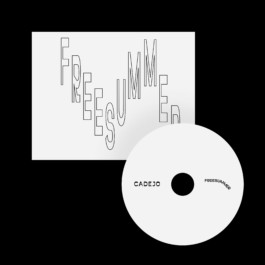
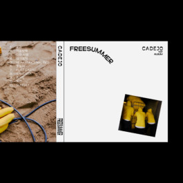
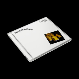
CADEJO BRANDING & MV
Branding, Physical Album Design, MV Direction, Social
2020
Descente 20FW Campaign
Client: DESCENTE,KR
Project Management, Photo Direction, Branding, Graphic
2023
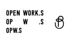
OPWS --COMING SOON--
Branding, UI&UX(E-commerce & APP)
2020
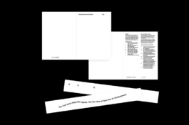
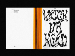
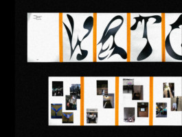
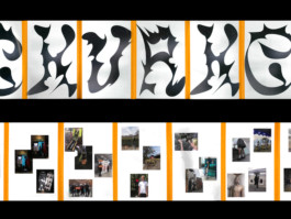
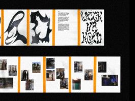
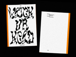
WATCH YOUR HEAD PAMPHLET
EDITORIAL
2020
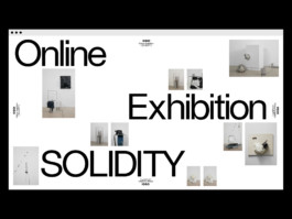
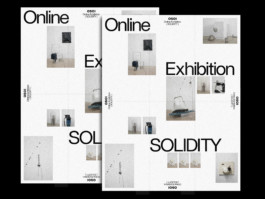
OSOI EXHIBITION "SOLIDITY"
Client: Osoi, KR
DIGITAL EXHIBITION DESIGN
2020
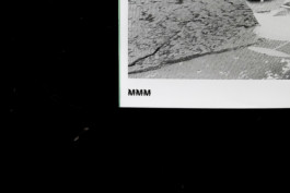
Maker's Mark Digital Editorial
Client: HYPEBEAST, KR
DIGITAL DESIGN


2020
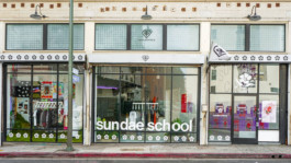
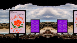
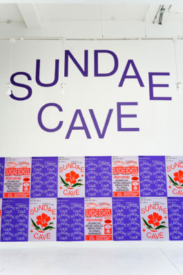
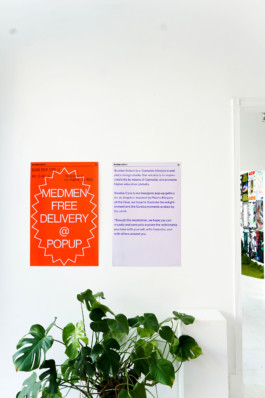
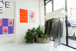
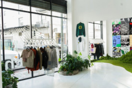
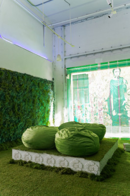
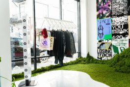
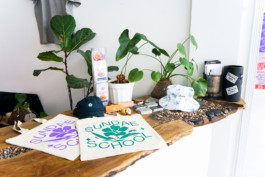
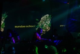
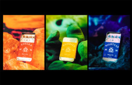
SUNDAE SCHOOL: SUNDAE CAVE LA POPUP STORE
CREATIVE DIRECTION/SPATIAL DESIGN/BRANDING
2020
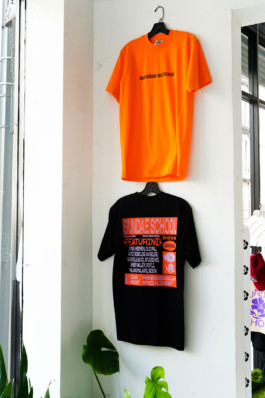
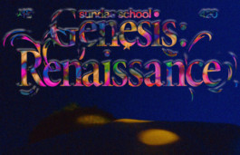
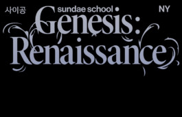
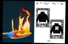
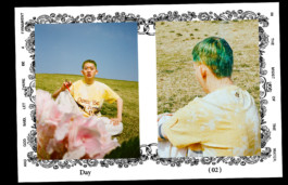
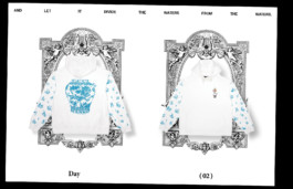
SUNDAE SCHOOL "GENESIS" COLLECTION
CREATIVE DIRECTION/ART DIRECTION/DESIGN


2019
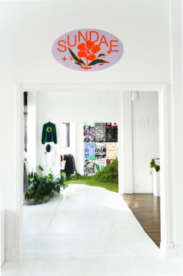
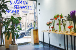
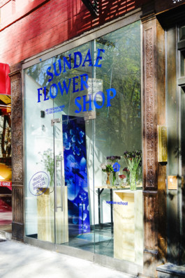
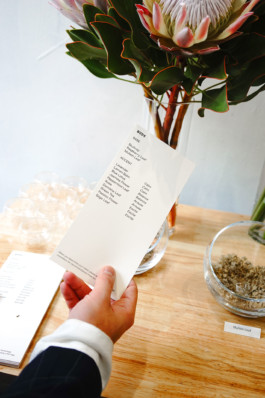
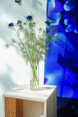
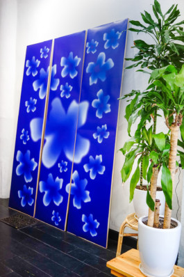
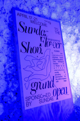
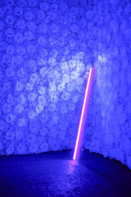
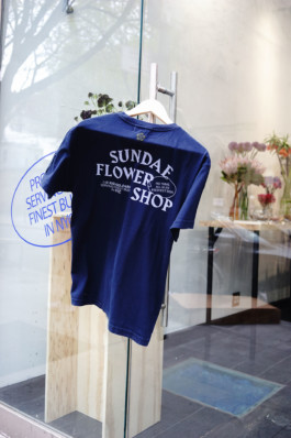
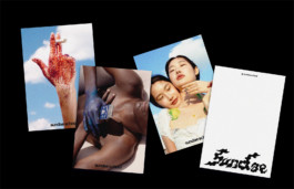
SUNDAE FLOWER SHOP
IDENTITY SYSTEM/SPATIAL DESIGN
2019
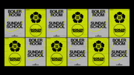
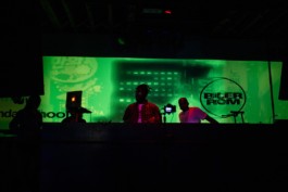
BOILER ROOM X SUNDAE SCHOOL
BRANDING/MOTION/SPATIAL DESIGN
2020
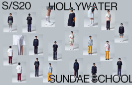
S/S20: HOLY WATER
CREATIVE DIRECTION/FASHION
2019
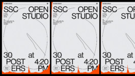
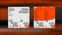
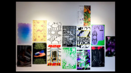
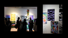
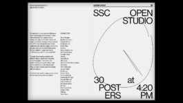
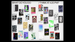
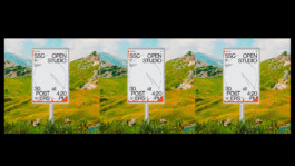
420 POSTER EXHIBITION
STRATEGY, BRANDING
2020
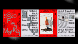
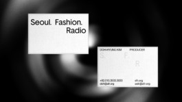
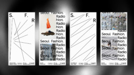
SEOUL FASHION RADIO
BRANDING
2019
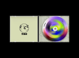
CADEJO 1ST ALBUM "FREEBODY"
ALBUM DESIGN
2019
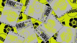
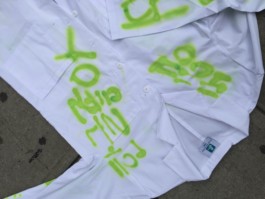
SUNDAE SCHOOL CANNABIS LAUNCHING CAMPAIGN
PACKAGE DESIGN/ART DIRECT/EDITORIAL
2019
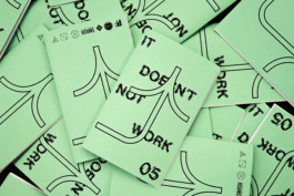
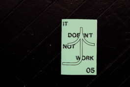
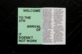
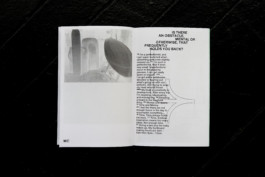
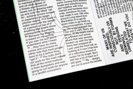
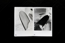
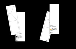
IT DOESN'T NOT WORK ISSUE 05
EDITORIAL
An exuberant, experimental, community-oriented surfboard exhibition, It Doesn’t Not Work is hosted every Spring by Wax friends’ Picture Farm Studios in Williamsburg, Brooklyn. Each year, Wax works with Picture Farm to the author and produces a catalog ‘zine that captures the spirit and craft of the corresponding show. The form of each zine often matches the idiosyncrasy of the surf craft — handmade, unexpected, and unique.
2017
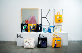
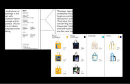
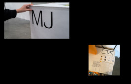
MJ SOLO EXHIBITION
MJ POPUP is the exhibition of Minjoo Lee, who is a fine artist, based in Los Angeles. Conversion of the canvas is the main thesis of this exhibition. The identity system united artworks in a voice and communicate the artist's ethos and message unconsciously. It gives the ironic to the people by showcase the solid grid system with abstract painting on the bag(as a canvas)


2018
<SELF INITIATED PROJECT>
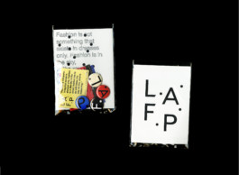
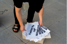
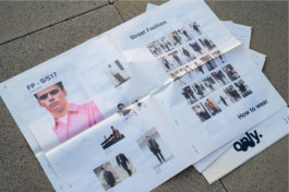
LAFP: LOS ANGELES FASHION PARISH
BRANDING/EDITORIAL
LAFP is the new name of LA FASHION DISTRICT. LAFP is an innovative district for people interested in fashion and starting their creativity. LAFP has 4 districts that represent brands, manufacturers, select shops, and shows. Each of the districts has a code and color. LAFD helps Fashion Designers/Startup brands to promote themselves. People can experience different levels of brands and cultures. Fashion is not just a beauty of the surface, more than that, it is an expression and language of one’s ideas, culture, and identities. Through the LAFP, people can experience and communicate with other cultures and identities. Also, they will be educated in different kinds of cultures and start to understand others.
2018
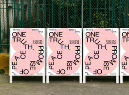
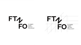
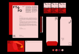
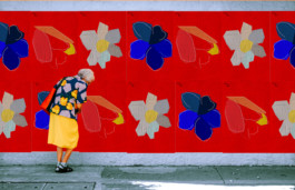
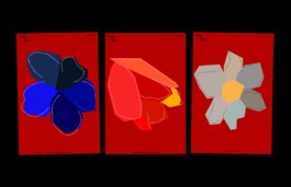
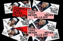
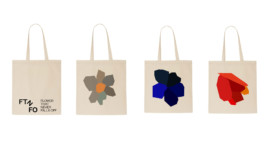
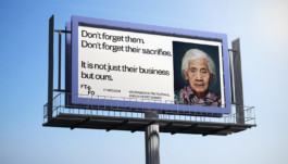
FTNFO: FLOWER THAT NEVER FALLS OFF
BRANDING/EDITORIAL/UI&UX/EXHIBITION/INSTALLATION
FTNFO: Flower That Never Falls Off is an international non-profit organization raising awareness for the fate of so-called comfort women, i.e. women and girls forced into sexual slavery by the Imperial Japanese Army in occupied territories before and during World War II. The term “comfort women” is a translation of the Japanese ianfu, a euphemism for prostitutes.
FTNFO represents the human rights of the victims of the war and deals with the repetition of the same mistakes in the future by educating people about our history. To stand for comfort women, two graphic languages are used consistently. One is the simple shape of the flower. As each flower has a unique message of youth and Beauty. And by rotating type as treatment, It poetically visualizes comfort women’s message.


2017
<SELF INITIATED PROJECT>
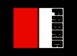
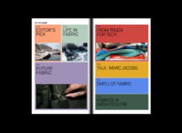
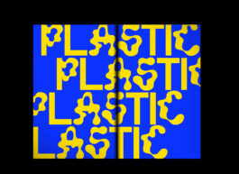
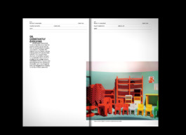
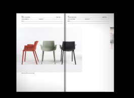
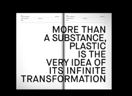
BANALITY MAGAZINE
BRANDING/EDITORIAL
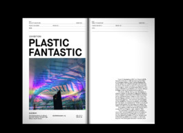
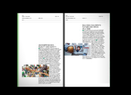
Banality magazine is about Materials. Every issue is introduced and curated in different uses and perspectives within selected materials for designers. The abundance of concrete, glass, textiles, metals, and other materials can form civilization. Materials are invented and made by humans, but on the contrary, the material makes us human beings.
Issue01: Plastic
Issue02: Fabric
2018
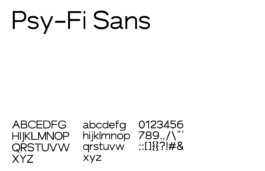
PSY FI SANS
FONT DESIGN
Psy-Fi Sans is the open sans that the form is inspired by high technology hardware, with medium weight, low contrast, and wide. Psy-Fi Sans is used for science and technology magazines, editorials, displays, and identity. Psy-Fi Sans has a unique relationship between letters as rt / ae / sa / rf / ra.
BASED IN SAN FRANCISCO
PHILLIPKIM0503@GMAIL.COM
SELECTED WORKS:
CREATIVE SERVICES:
BRANDING, DIGITAL DESIGN, UIUX, CREATIVE DIRECTION, ART DIRECTION, and PHOTOGRAPHY
2022
NIKE KOREA
Branding, Art Direction
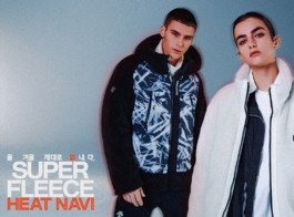
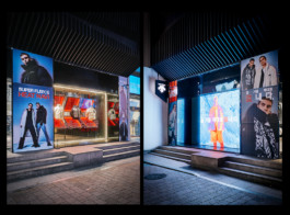
2024
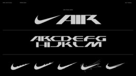
NIKE AIR
Branding, Graphic
2023-24
LULULEMON
Event Branding & Graphic
2023
NIKE NYC
WWC collaboration
2023-24
NIKE AIRMAX
Graphic Design
2023
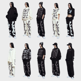
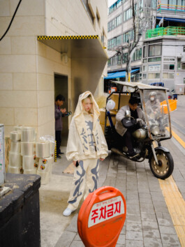
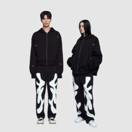
DOUBLE HAPPINESS
Branding, Art Direction
2023
ROSEWOOD
Branding, Art Direction
2023-24 --COMING SOON--
WOOALONG
Branding, Art Direction
2023
NIKE x Phillip Windly Kim Collaboration for the Pegasus 40
Graphic Design
2023
LONER
Branding, Art Direction, Social Contents
2024
MUSINSA STANDARD x PHILLIP KI<
Graphic Collaboration
2023 -- COMING SOON --
CCCS
Branding, Art Direction, Strategy
2023
NIKE x KWONDO
Campaign Branding, Graphic Production
2023 -- COMING SOON --
CAELO
Branding, Art Direction, Strategy, Motion, UI&UX, Product
2023
NIKE NYC
Branding, Graphic Design
2022
SAMSUNG
Collaboration
2022
EERST
Branding
2023
PAGEMAIL
Branding
2022
CIRCUIT SEOUL2 EXHIBITION
Branding, Art Direction, Spatial Design
2022
NIKE HONGDAE
Poster Series
2022
DESCENTE KOREA
Graphic Design, Retail Design
2023
AZUKI
Art Direction, Graphic Design
2021
Maggie, Wine Bar+Bistro.
Branding, Art Direction
2021
NIKE NYC x Phillip Windly Kim
NBY Collaboration
2021
COOR
Branding, Art Direction, Web, Social
2021
Exhibition Circuit Seoul#1 Circulation
Strategy, Branding, UIUX, Motion, Spatial Design
2023
SINOO
Branding
2020-2021
PPS
Branding, Art Direction, Social
PP(S), PostPleasure(Sound) is the bar and bistro located in Seoul, Korea.
The bistro served dry-aging hamburger with special source and selected electronic music.
The forms are from the wave of the sound and pleasure of the good taste.
2020
POST ARCHIVE FACTION x PHILLIP KIM
Art Direction, Merch Design
2021
NIKE x LMC Exhibition, Although
Client: LMC
Branding, Art Direction, Installation
2021
CADEJO BRANDING & MV
Branding, Physical Album Design, MV Direction, Social
2020
WATCH YOUR HEAD PAMPHLET
EDITORIAL
2023
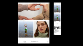
OPWS --COMING SOON--
Branding, UI&UX(E-commerce & APP)
2020
Descente 20FW Campaign
Client: DESCENTE,KR
Project Management, Photo Direction, Branding, Graphic
2020
OSOI EXHIBITION "SOLIDITY"
Client: Osoi, KR
DIGITAL EXHIBITION DESIGN
2020
Maker's Mark Digital Editorial
Client: HYPEBEAST, KR
DIGITAL DESIGN
2020
SUNDAE SCHOOL: SUNDAE CAVE LA POPUP STORE
CREATIVE DIRECTION/SPATIAL DESIGN/BRANDING
2020
SUNDAE SCHOOL "GENESIS" COLLECTION
CREATIVE DIRECTION/ART DIRECTION/DESIGN
2019
SUNDAE FLOWER SHOP
IDENTITY SYSTEM/SPATIAL DESIGN
2019
BOILER ROOM X SUNDAE SCHOOL
BRANDING/MOTION/SPATIAL DESIGN
2020
S/S20: HOLY WATER
CREATIVE DIRECTION/FASHION
2019
420 POSTER EXHIBITION
STRATEGY, BRANDING
2020
SEOUL FASHION RADIO
BRANDING
2019
CADEJO 1ST ALBUM "FREEBODY"
ALBUM DESIGN
2019
SUNDAE SCHOOL CANNABIS LAUNCHING CAMPAIGN
PACKAGE DESIGN/ART DIRECT/EDITORIAL
2019
IT DOESN'T NOT WORK ISSUE 05
EDITORIAL
An exuberant, experimental, community-oriented surfboard exhibition, It Doesn’t Not Work is hosted every Spring by Wax friends’ Picture Farm Studios in Williamsburg, Brooklyn. Each year, Wax works with Picture Farm to the author and produces a catalog ‘zine that captures the spirit and craft of the corresponding show. The form of each zine often matches the idiosyncrasy of the surf craft — handmade, unexpected, and unique.
2017
MJ SOLO EXHIBITION
MJ POPUP is the exhibition of Minjoo Lee, who is a fine artist, based in Los Angeles. Conversion of the canvas is the main thesis of this exhibition. The identity system united artworks in a voice and communicate the artist's ethos and message unconsciously. It gives the ironic to the people by showcase the solid grid system with abstract painting on the bag(as a canvas)
2018
<SELF INITIATED PROJECT>
LAFP: LOS ANGELES FASHION PARISH
BRANDING/EDITORIAL
LAFP is the new name of LA FASHION DISTRICT. LAFP is an innovative district for people interested in fashion and starting their creativity. LAFP has 4 districts that represent brands, manufacturers, select shops, and shows. Each of the districts has a code and color. LAFD helps Fashion Designers/Startup brands to promote themselves. People can experience different levels of brands and cultures. Fashion is not just a beauty of the surface, more than that, it is an expression and language of one’s ideas, culture, and identities. Through the LAFP, people can experience and communicate with other cultures and identities. Also, they will be educated in different kinds of cultures and start to understand others.
2018
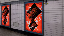
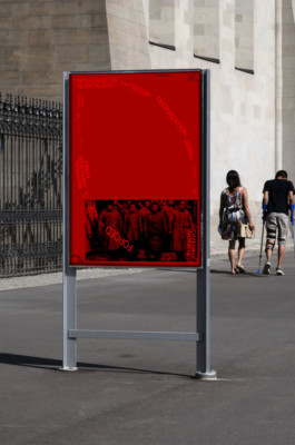
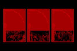
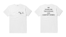
FTNFO: FLOWER THAT NEVER FALLS OFF
BRANDING/EDITORIAL/UI&UX/EXHIBITION/INSTALLATION
FTNFO: Flower That Never Falls Off is an international non-profit organization raising awareness for the fate of so-called comfort women, i.e. women and girls forced into sexual slavery by the Imperial Japanese Army in occupied territories before and during World War II. The term “comfort women” is a translation of the Japanese ianfu, a euphemism for prostitutes.
FTNFO represents the human rights of the victims of the war and deals with the repetition of the same mistakes in the future by educating people about our history. To stand for comfort women, two graphic languages are used consistently. One is the simple shape of the flower. As each flower has a unique message of youth and Beauty. And by rotating type as treatment, It poetically visualizes comfort women’s message.
2017
<SELF INITIATED PROJECT>
BANALITY MAGAZINE
BRANDING/EDITORIAL
Banality magazine is about Materials. Every issue is introduced and curated in different uses and perspectives within selected materials for designers. The abundance of concrete, glass, textiles, metals, and other materials can form civilization. Materials are invented and made by humans, but on the contrary, the material makes us human beings.
Issue01: Plastic
Issue02: Fabric
2018
PSY FI SANS
FONT DESIGN
Psy-Fi Sans is the open sans that the form is inspired by high technology hardware, with medium weight, low contrast, and wide. Psy-Fi Sans is used for science and technology magazines, editorials, displays, and identity. Psy-Fi Sans has a unique relationship between letters as rt / ae / sa / rf / ra.